
About
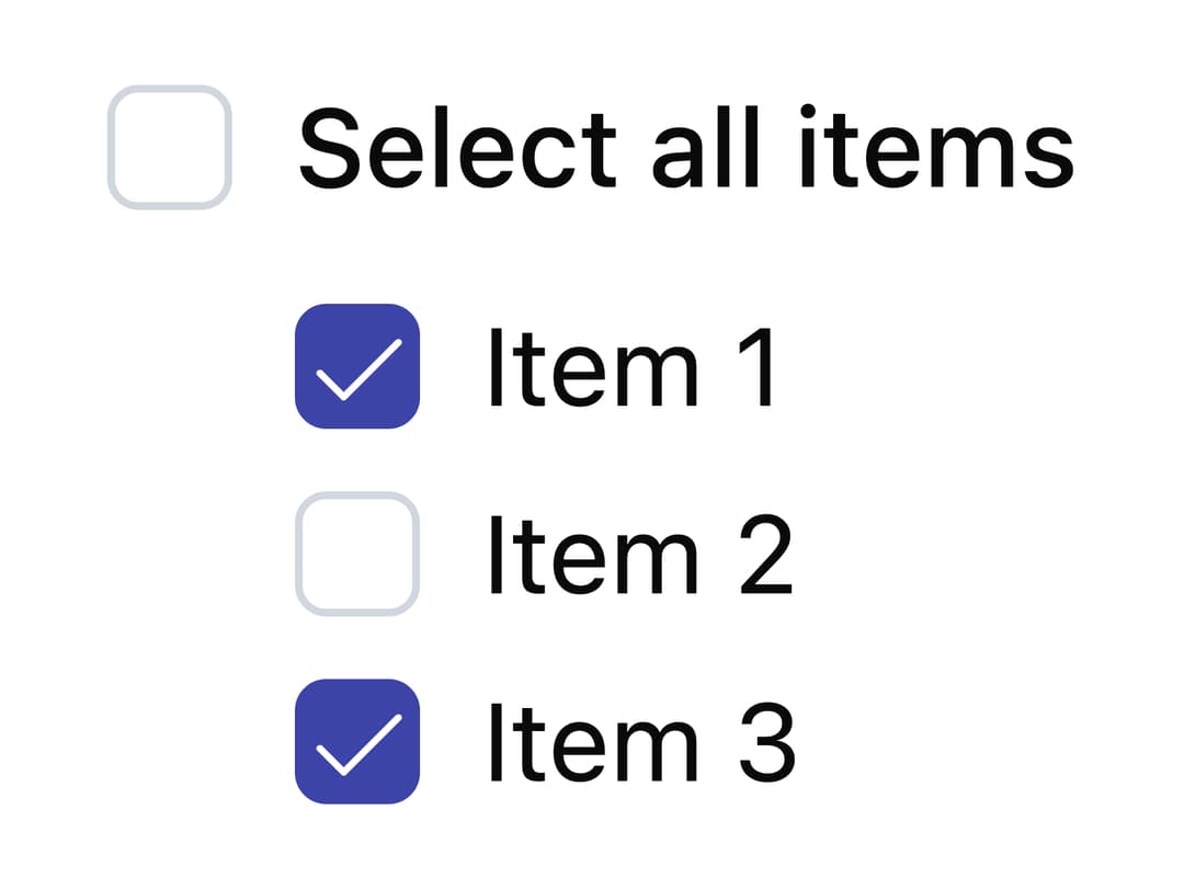
A checkbox control for selecting one or more options from a set, supporting checked, unchecked, indeterminate and disabled states.
Built with React and Tailwind. Copy the prompt and paste it into Claude Code, Cursor or Lovable: your agent adds Checkbox to your project and fits it to your theme.
Code
How Checkbox is used: the demo's code. The component's own source comes with a free account.
Usage.tsx
"use client";

import * as React from "react";
import { Checkbox } from "@/components/ui/checkbox";
import { Label } from "@/components/ui/label";

export default function IndeterminateCheckboxDemo() {
  const [items, setItems] = React.useState([
    { id: "1", label: "Item 1", checked: true },
    { id: "2", label: "Item 2", checked: false },
    { id: "3", label: "Item 3", checked: true },
  ]);

  const allChecked = items.every((item) => item.checked);
  const someChecked = items.some((item) => item.checked) && !allChecked;

  const toggleAll = () => {
    const newValue = !allChecked;
    setItems(items.map((item) => ({ ...item, checked: newValue })));
  };

  const toggleItem = (id: string) => {
    setItems(
      items.map((item) =>
        item.id === id ? { ...item, checked: !item.checked } : item,
      ),
    );
  };

  return (
    <div className="space-y-3">
      <div className="flex items-center space-x-2">
        <Checkbox
          id="select-all"
          checked={someChecked ? "indeterminate" : allChecked}
          onCheckedChange={toggleAll}
        />
        <Label htmlFor="select-all" className="font-medium">
          Select all items
        </Label>
      </div>
      <div className="ml-6 space-y-2">
        {items.map((item) => (
          <div key={item.id} className="flex items-center space-x-2">
            <Checkbox
              id={item.id}
              checked={item.checked}
              onCheckedChange={() => toggleItem(item.id)}
            />
            <Label htmlFor={item.id} className="font-normal">
              {item.label}
            </Label>
          </div>
        ))}
      </div>
    </div>
  );
}
Dependencies
More by Mahmoud Ilyan
View all
Radio Card
Switch
Segmented Control
Avatar
More in Forms
View all

Premium Auth
562

Book A Demo 1
90
Book A Demo 3
101

Contact Card
1.1K

Card Studio
46

Form
139
Authentication Card
51

Form
3
