
About
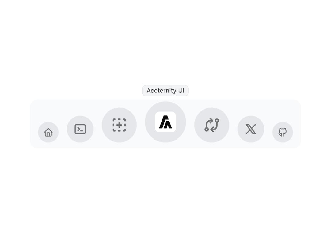
A macOS-style dock navigation where icons magnify on hover, with a separate collapsible menu on mobile.
Built with React and Tailwind. Copy the prompt and paste it into Claude Code, Cursor or Lovable: your agent adds Floating Dock to your project and fits it to your theme.
Code
How Floating Dock is used: the demo's code. The component's own source comes with a free account.
Usage.tsx
import React from "react";
import { FloatingDock } from "@/components/ui/floating-dock";
import {
  IconBrandGithub,
  IconBrandX,
  IconExchange,
  IconHome,
  IconNewSection,
  IconTerminal2,
} from "@tabler/icons-react";

export default function FloatingDockDemo() {
  const links = [
    {
      title: "Home",
      icon: (
        <IconHome className="h-full w-full text-neutral-500 dark:text-neutral-300" />
      ),
      href: "#",
    },
    {
      title: "Products",
      icon: (
        <IconTerminal2 className="h-full w-full text-neutral-500 dark:text-neutral-300" />
      ),
      href: "#",
    },
    {
      title: "Components",
      icon: (
        <IconNewSection className="h-full w-full text-neutral-500 dark:text-neutral-300" />
      ),
      href: "#",
    },
    {
      title: "Aceternity UI",
      icon: (
        <img
          src="https://cdn.21st.dev/assets/mirror/b0/b01d86a4b524d129b752a71ca8faf20c4f89447742e65315f1b8bc3e5e72745d.png"
          width={20}
          height={20}
          alt="Aceternity Logo"
        />
      ),
      href: "#",
    },
    {
      title: "Changelog",
      icon: (
        <IconExchange className="h-full w-full text-neutral-500 dark:text-neutral-300" />
      ),
      href: "#",
    },
    {
      title: "Twitter",
      icon: (
        <IconBrandX className="h-full w-full text-neutral-500 dark:text-neutral-300" />
      ),
      href: "#",
    },
    {
      title: "GitHub",
      icon: (
        <IconBrandGithub className="h-full w-full text-neutral-500 dark:text-neutral-300" />
      ),
      href: "#",
    },
  ];
  return (
    <div className="flex h-[35rem] w-full items-center justify-center">
      <FloatingDock mobileClassName="translate-y-20" items={links} />
    </div>
  );
}
Dependencies
More by Manu Arora
View all
Container Scroll Animation
10.2K
Glowing Effect
4.4K
Aurora Background
4.4K
Timeline
4.3K
Sparkles
4.1K
Lamp
3.7K
Sidebar
3.6K
Bento Grid
2.7K
More in Navigation
View all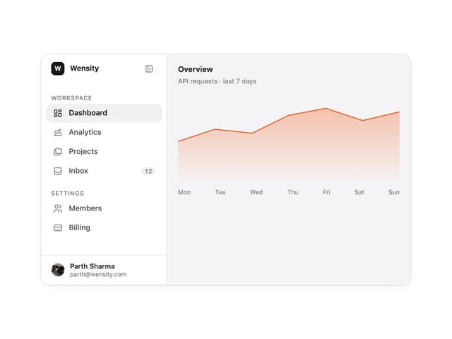

Sidebar
225

Tabs
52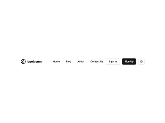
Navbar with Theme Toggle
41
Breadcrumb
12
Nav List Card
30
Pagination Ant
3

Pagination
85
Pagination
9


