
About
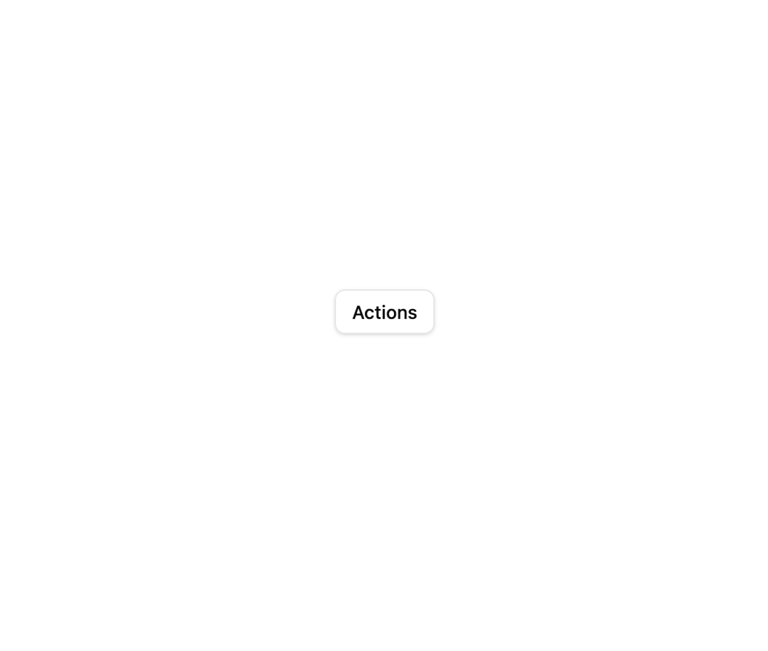
A clickable trigger that opens a positioned popup menu of actions, with separators, labels, keyboard navigation and shortcut hints.
Built with React and Tailwind. Copy the prompt and paste it into Claude Code, Cursor or Lovable: your agent adds Dropdown Menu to your project and fits it to your theme.
Code
How Dropdown Menu is used: the demo's code. The component's own source comes with a free account.
Usage.tsx
import { DropdownMenu } from "@/components/ui/dropdown-menu";

export function Example() {
  return (
    <div className="flex min-h-[260px] w-full items-center justify-center">
      <DropdownMenu
        trigger={
          <button className="inline-flex items-center justify-center rounded-md border px-3 py-1.5 text-sm font-medium shadow-sm hover:bg-accent hover:text-accent-foreground">
            Actions
          </button>
        }
        align="start"
        items={[
          { id: "label", type: "label", label: "filesystem-mcp" },
          {
            id: "restart",
            label: "Restart server",
            shortcut: "⌘R",
            onSelect: () => {},
          },
          { id: "logs", label: "View logs", onSelect: () => {} },
          { id: "sep", type: "separator", label: "" },
          { id: "remove", label: "Remove", onSelect: () => {} },
        ]}
      />
    </div>
  );
}

export default Example;
Dependencies
More by mayurrawte
View all
Skeleton

Avatar
Textarea
Loader
Separator
More in Navigation
View all

Sidebar
342

Pagination
99
Oversized 404 Numeral
68
Stacked Circular Footer
444
Navbar
6

Navbar
75

Tabs
33
Tabs like bookmark
73


