
About
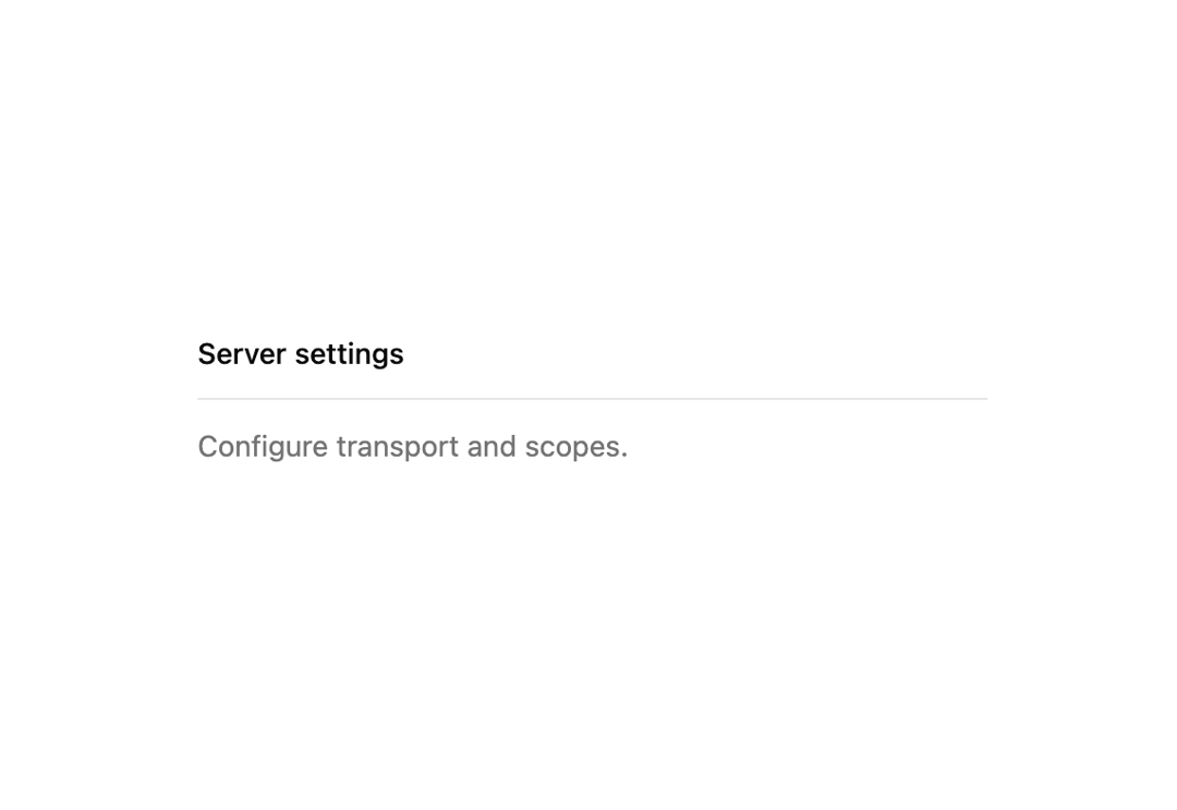
A thin horizontal or vertical divider line used to visually separate sections of content or items in a toolbar.
Built with React and Tailwind. Copy the prompt and paste it into Claude Code, Cursor or Lovable: your agent adds Separator to your project and fits it to your theme.
Code
How Separator is used: the demo's code. The component's own source comes with a free account.
Usage.tsx
import Separator from "@/components/ui/separator";

export default function SeparatorDemo() {
  return (
    <div className="w-full max-w-sm space-y-3">
      <p className="text-sm font-medium">Server settings</p>
      <Separator />
      <p className="text-sm text-muted-foreground">
        Configure transport and scopes.
      </p>
    </div>
  );
}
Dependencies
More by mayurrawte
View all
Dropdown Menu

Skeleton

Avatar

Textarea
Loader
More in Cards
View all

Course Design Cards
1.2K
Stats cards with links
128

Interactive Tech Stack Bento Grid with Hover Effects
397

Statistics Card 2
291

Card Studio
14
Statistics Card 10
281
The Item one
3
Card
70
