
About
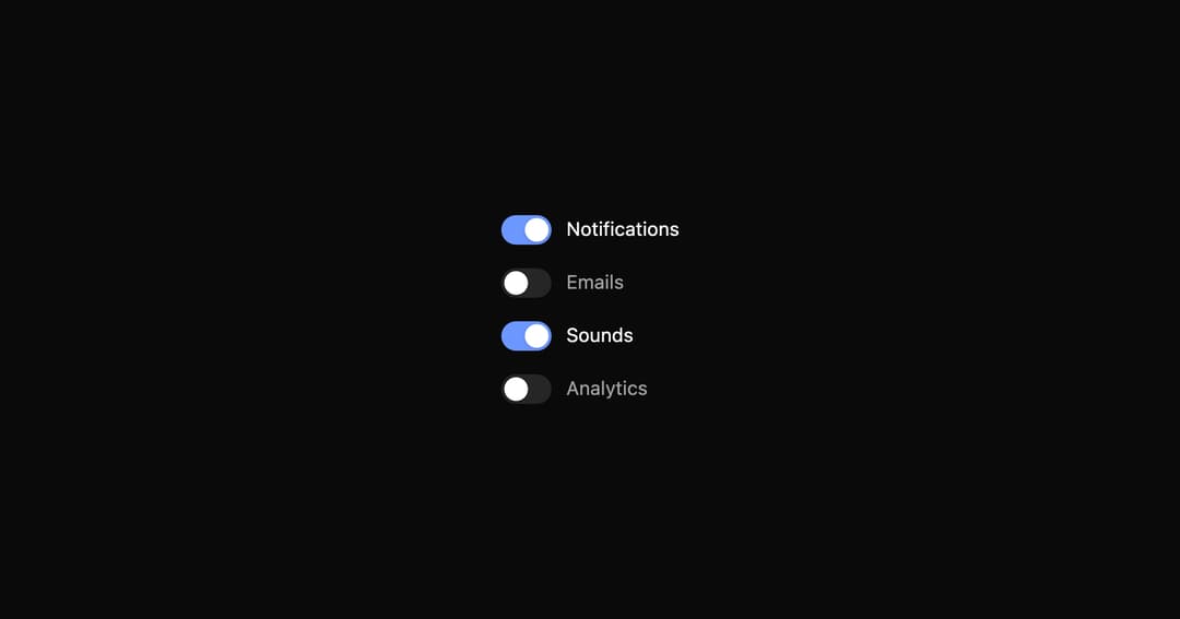
A fluid animated switch with draggable thumb, smooth pill morphing on hover/press, and accessible keyboard support.
Built with React and Tailwind. Copy the prompt and paste it into Claude Code, Cursor or Lovable: your agent adds Switch to your project and fits it to your theme.
Code
How Switch is used: the demo's code. The component's own source comes with a free account.
Usage.tsx
"use client";

import { useState } from "react";
import { Switch } from "../components/ui/switch";

export default function SwitchGroupDemo() {
  const [states, setStates] = useState({ notifications: true, emails: false, sounds: true, analytics: false });
  const toggle = (key: keyof typeof states) => setStates(s => ({ ...s, [key]: !s[key] }));
  return (
    <div className="flex items-center justify-center min-h-screen bg-background">
      <div className="transform scale-150 flex flex-col">
        <Switch label="Notifications" checked={states.notifications} onToggle={() => toggle("notifications")} />
        <Switch label="Emails" checked={states.emails} onToggle={() => toggle("emails")} />
        <Switch label="Sounds" checked={states.sounds} onToggle={() => toggle("sounds")} />
        <Switch label="Analytics" checked={states.analytics} onToggle={() => toggle("analytics")} />
      </div>
    </div>
  );
}
Dependencies
More by micka_design
View all

Select
86
Checkbox Group
82
Segmented Tabs
48
Table
40
Accordion
38
Tabs Subtle
25
Slider
24
Button
19
More in Forms
View all

Form
17

Premium Auth
568

Login 1
62

Book A Demo 1
90

Contact Card
1.1K
Book A Demo 3
101

Card Studio
46

Login Card
33