
About
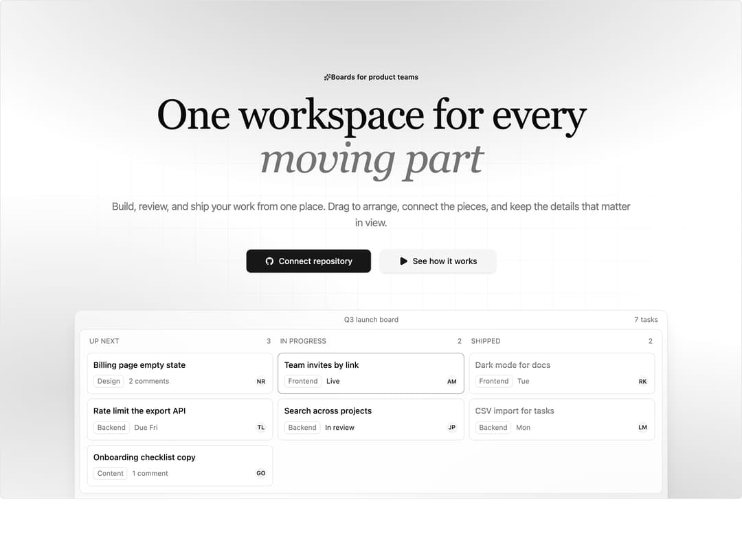
Centered hero on a framed, token-lit panel: a pill badge, a serif headline with an italic emphasis span, sub-copy, dual CTA buttons, and a window preview of a task board with named cards and statuses. Everything rises in with a staggered entrance that respects reduced motion.
Built with React and Tailwind. Copy the prompt and paste it into Claude Code, Cursor or Lovable: your agent adds App Preview Hero to your project and fits it to your theme.
Code
How App Preview Hero is used: the demo's code. The component's own source comes with a free account.
Usage.tsx
import Hero08 from "@/components/ui/hero-08";

export default function Hero08Demo() {
  return (
    <div className="w-full min-h-screen bg-background text-foreground">
      <Hero08 />
    </div>
  );
}
Dependencies
More by Mohammad Shehadeh
View all
Feature Problem Cards
94
Ecommerce Category Page
83
Feature Grid Spotlight Cards
83
Split Login
76
Comparison Section
71
FAQ Two Column
71
Dithered Shader CTA
70
Comparison Table
66
More in Heroes
View all

Responsive Hero Banner
2.1K

SaaS Template
2.6K
Centered Hero with Image Fan
1K

Hero
1.3K

Hero Section
434
Editorial Collage Hero
474

Hero 03
346
Hero with image, text and two buttons
217
