
About
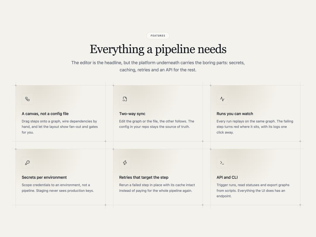
Six-card feature grid on hairline rails: each card carries an inline icon beside its title, a title and a description, corner crosshair marks, and a radial spotlight that follows the pointer on hover. Warm-tinted top glow per card.
Built with React and Tailwind. Copy the prompt and paste it into Claude Code, Cursor or Lovable: your agent adds Feature Grid Spotlight Cards to your project and fits it to your theme.
Code
How Feature Grid Spotlight Cards is used: the demo's code. The component's own source comes with a free account.
Usage.tsx
import Feature08 from "@/components/ui/feature-08";

export default function Feature08Demo() {
  return <Feature08 />;
}
Dependencies
More by Mohammad Shehadeh
View all
Feature Problem Cards
94
Ecommerce Category Page
83
Split Login
77
Comparison Section
72
Dithered Shader CTA
71
FAQ Two Column
71
Comparison Table
66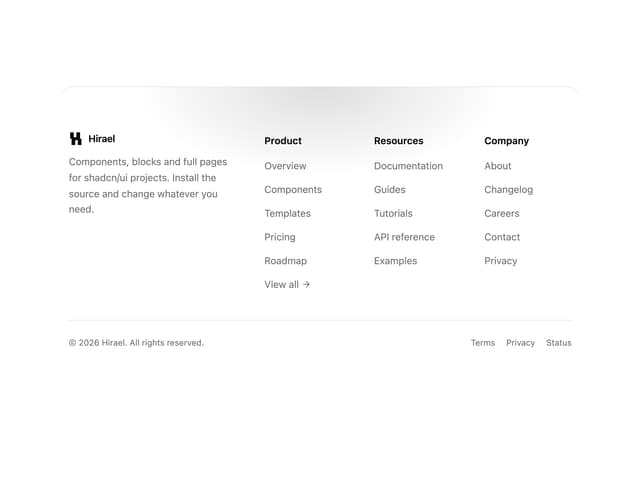
Rounded Top Footer
63
More in Features
View all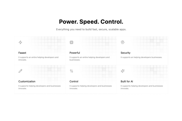

Grid Feature Cards
1.9K

Feature Sections
54

Features 8
3.1K

Feature 1
118
Features Card
245
Feature Modern
11
Feature 2
79
Feature 72
133

