
About
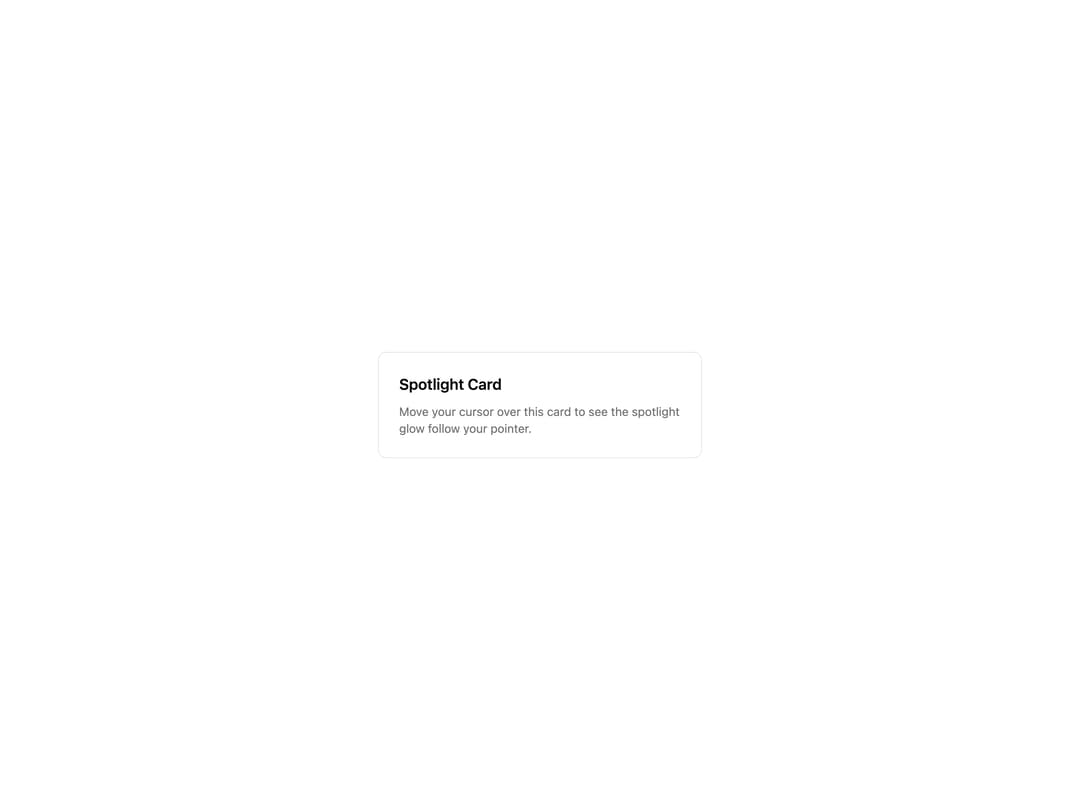
Card surface with a crisp spotlight that tracks the cursor and fades in on hover. Built on Cursor Glow and design tokens.
Built with React and Tailwind. Copy the prompt and paste it into Claude Code, Cursor or Lovable: your agent adds Spotlight Card to your project and fits it to your theme.
Code
How Spotlight Card is used: the demo's code. The component's own source comes with a free account.
Usage.tsx
import { SpotlightCard } from "@/components/ui/spotlight-card";

export default function SpotlightCardDemo() {
  return (
    <div className="flex min-h-[400px] w-full items-center justify-center bg-background p-8">
      <SpotlightCard className="w-full max-w-sm p-6">
        <h3 className="text-lg font-semibold text-card-foreground">
          Spotlight Card
        </h3>
        <p className="mt-2 text-sm text-muted-foreground">
          Move your cursor over this card to see the spotlight glow follow your
          pointer.
        </p>
      </SpotlightCard>
    </div>
  );
}
Dependencies
More by Mohammad Shehadeh
View all
Feature Problem Cards
94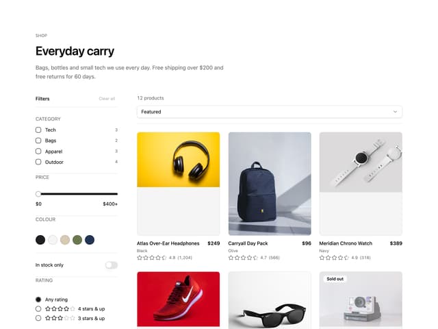
Ecommerce Category Page
83
Feature Grid Spotlight Cards
83
Split Login
76
Comparison Section
71
FAQ Two Column
71
Dithered Shader CTA
70
Comparison Table
66
More in Cards
View all
Stats cards with links
40

Course Design Cards
1.2K

Interactive Tech Stack Bento Grid with Hover Effects
402

Card Studio
14

Statistics Card 2
291
Statistics Card 7
309
The Item one
3
Card
70
