
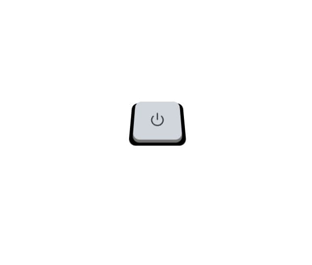
An interactive 3D-styled button component featuring a realistic press animation. The button uses CSS transforms and shadows to create a layered, three-dimensional appearance with a black cover plate and gray button surface. When pressed, it smoothly animates downward while the shadow disappears, simulating a physical button being pushed. Built with React and Tailwind CSS, it includes hover states and smooth transitions for an engaging user experience. Perfect for adding tactile feedback to interfaces that need a premium, interactive feel.
Built with React and Tailwind. Copy the prompt and paste it into Claude Code, Cursor or Lovable: your agent adds Animated Power Button to your project and fits it to your theme.
Code
How Animated Power Button is used: the demo's code. The component's own source comes with a free account.
Usage.tsx
import { Button3D } from "@/components/ui/animated-power-button";

export default function DemoOne() {
  return <Button3D />;
}
Dependencies
More by M.bin Salman
View all

Ethereal Beams Hero
1.1K
Rainbow Borders Button
468
Waitlist Landing Page with Countdown Timer
354
Shiny Button
349
Shiny Borders Button
324
Stardust Button
286
Shiny Button
273
Boxy App Icons
168
More in Buttons
View all
Button
12

Notification Button
115
Texture Button
105

HeroUI Button Group
2
Button
78

App Store Button
481
Split Button
15

Button Group
14


