
About
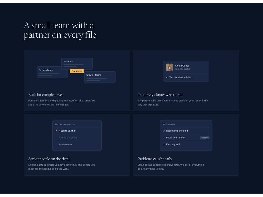
A dark bento grid of four feature cards, each with its own small animated UI: chips that gather around a highlight, a person card, wrong options being struck out and a review list where a flag appears and then resolves. Each card plays when it scrolls into view.
Built with React and Tailwind. Copy the prompt and paste it into Claude Code, Cursor or Lovable: your agent adds Bento Mini UI to your project and fits it to your theme.
Code
How Bento Mini UI is used: the demo's code. The component's own source comes with a free account.
Usage.tsx
import { BentoMiniUI } from "@/components/ui/bento-mini-ui"

const IMG = "https://cdn.jsdelivr.net/gh/rm-sjent/21st-assets@v1/img/"

export default function BentoMiniUIDemo() {
  return (
    <div className="w-full bg-white" style={{ fontFamily: "Geist, ui-sans-serif, system-ui, sans-serif" }}>
      <link rel="stylesheet" href="https://fonts.googleapis.com/css2?family=Geist:wght@300..600&family=Newsreader:ital,opsz,wght@0,6..72,300..500;1,6..72,300..400&display=swap" precedence="default" />
      <style>{`.font-serif{font-family:"Newsreader","Iowan Old Style","Palatino Linotype",Georgia,serif}`}</style>
      <BentoMiniUI person={{ name: "Amara Okoye", role: "Founding partner", photo: `${IMG}person-amara.jpg` }} />
    </div>
  )
}
Dependencies
More by Sajad Entesari
View all

Sector Wheel
5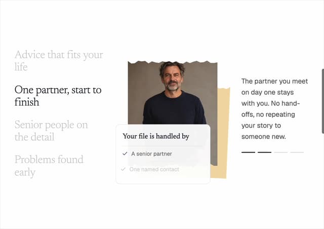
Torn Portrait Scroll
3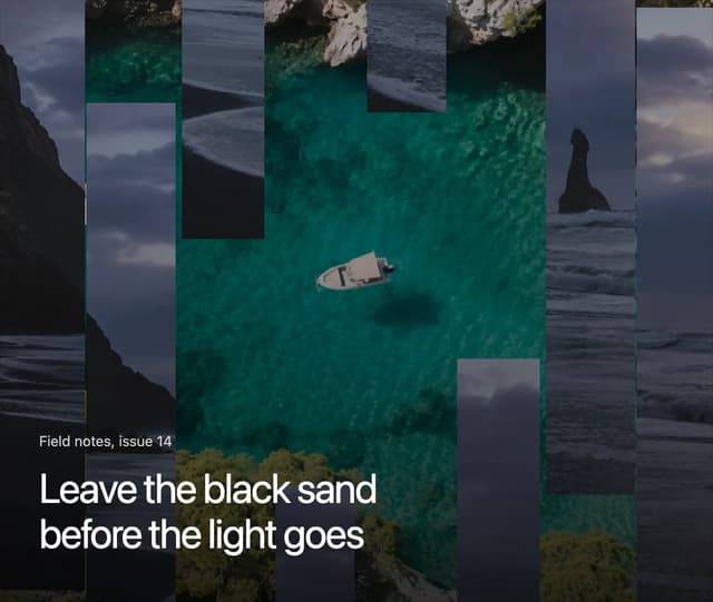
Slat Shutter Hero
2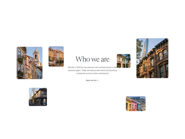
Scattered About
1
Scroll Fill Headline
1
Morph Island
1
Timeline Scrubber
1
Feature UI Row
More in Features
View all

Grid Feature Cards
1.9K

Feature Sections
114
Feature with advantages
296

Features 8
3.2K
Features Card
262
Feature with image
155

Feature 72
137
Feature Section with card gradient
174


