About
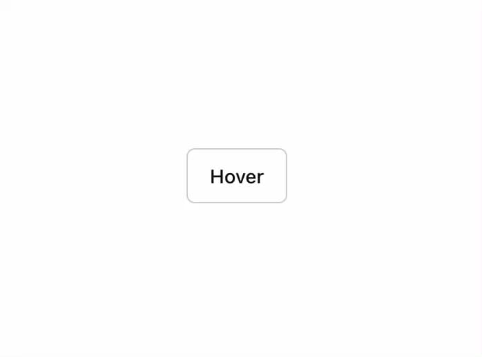
A popup that displays information related to an element when the element receives keyboard focus or the mouse hovers over it.
Built with React and Tailwind. Copy the prompt and paste it into Claude Code, Cursor or Lovable: your agent adds Tooltip to your project and fits it to your theme.
Code
How Tooltip is used: the demo's code. The component's own source comes with a free account.
Usage.tsx
import { Button } from "@/components/ui/button"
import {
  Tooltip,
  TooltipContent,
  TooltipProvider,
  TooltipTrigger,
} from "@/components/ui/tooltip"

export function TooltipDemo() {
  return (
    <TooltipProvider>
      <Tooltip>
        <TooltipTrigger asChild>
          <Button variant="outline">Hover</Button>
        </TooltipTrigger>
        <TooltipContent>
          <p>Add to library</p>
        </TooltipContent>
      </Tooltip>
    </TooltipProvider>
  )
}
Dependencies
More by shadcn
View all

Navigation menu
803
Calendar with time pressets
526
Sidebar
357
Sonner
248
Chart
227
Icons
207
Dropdown Menu
159
Calendar with event slots
124
More in Buttons
View all
Texture Button
106

Notification Button
115

Button
1
Button
12
Base Button
1

HeroUI Button Group


App Store Button
483

Button
35

