
About
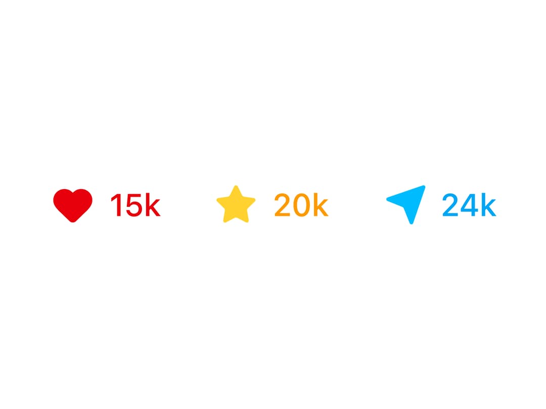
A group of toggle checkboxes that swap between an outline and a filled colored icon (heart, star, send) to show a liked/favorited/sent state, similar to social media like buttons.
Built with React and Tailwind. Copy the prompt and paste it into Claude Code, Cursor or Lovable: your agent adds Checkbox With Custom Icons to your project and fits it to your theme.
Code
How Checkbox With Custom Icons is used: the demo's code. The component's own source comes with a free account.
Usage.tsx
import CheckboxCustomIcons from "@/components/ui/checkbox-07";

export default function CheckboxCustomIconsDemo() {
  return (
    <div className="flex items-center justify-center p-10">
      <CheckboxCustomIcons />
    </div>
  );
}
Dependencies
More by ShadcnSpace
View all
Integration Card
1.9K
Stacked Card Carousel
1.6K
Button witn Icon
1.5K
Orbiting Circles with Globe
1.4K
Agency Hero Section
952
Testimonials Marquee
640
Shine Border
485
Range Select Calendar
470
More in Buttons
View all
Texture Button
104
Button
12
Native Button
27

Button
19
Button
78

HeroUI Button Group
5
Button
1

App Store Button
476


