
About
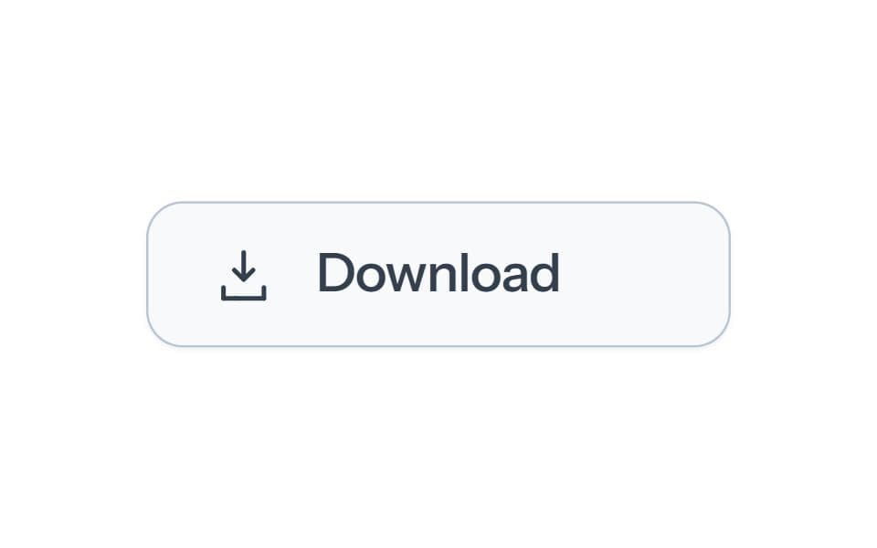
A download arrow that settles into a confirmation. Includes White, Black and Blue palettes and an interactive demo.
Built with React and Tailwind. Copy the prompt and paste it into Claude Code, Cursor or Lovable: your agent adds Matte Download to your project and fits it to your theme.
Code
How Matte Download is used: the demo's code. The component's own source comes with a free account.
Usage.tsx
import {useState as useTransferState,useEffect as useTransferEffect,useRef as useTransferRef} from 'react';
'use client';
import {useState} from 'react';
import Component from '@/components/ui/matte-download';
// Demo only. Replace handlers with your real application operations.
function wait(signal){return new Promise((resolve,reject)=>{if(signal?.aborted){reject(new DOMException('Canceled','AbortError'));return;}const timer=setTimeout(()=>{signal?.removeEventListener('abort',abort);resolve();},700);function abort(){clearTimeout(timer);reject(new DOMException('Canceled','AbortError'));}signal?.addEventListener('abort',abort,{once:true});});}

const defaults={palette:"white",presentation:"download"};
const presentations={"download":"Original","download-text":"Text","download-icon":"Icon"};
export default function Demo(props={}){
 const [transferPalette,setTransferPalette]=useTransferState(defaults.palette),[transferPresentation,setTransferPresentation]=useTransferState(defaults.presentation);
 useTransferEffect(()=>{if(['white','black','blue'].includes(props.palette))setTransferPalette(props.palette);if(Object.hasOwn(presentations,props.presentation))setTransferPresentation(props.presentation);},[props.palette,props.presentation]);
 const s={...defaults,...props,palette:transferPalette,presentation:transferPresentation};
 const [message,setMessage]=useState("Local demonstration. No server data is changed.");
 return <div style={{width:"100%",minHeight:360,padding:"clamp(12px, 4vw, 32px)",boxSizing:"border-box",display:"flex",flexDirection:"column",alignItems:"center",justifyContent:"center",gap:24,color:"var(--color-foreground)"}}><DemoSurface palette={s.palette} presentation={s.presentation} callbacks={{getFile:async({signal})=>{await wait(signal);return {blob:new Blob(['Local example'],{type:'text/plain'}),filename:'example.txt'};},handoff:async()=>setMessage('Local handoff preview. No file was downloaded.')}} onError={error=>setMessage(error.message)}/><p role="status" style={{margin:0,maxWidth:380,textAlign:"center",fontSize:12,lineHeight:1.5,color:"var(--color-muted-foreground)",width:"100%",minHeight:"3lh",overflowWrap:"anywhere"}}>{message}</p><div aria-label="Demo options" style={{display:'flex',alignItems:'center',justifyContent:'center',gap:16,flexWrap:'wrap'}}><div role="group" aria-label="Palette" style={{display:'flex',gap:8}}>{[['white','#fafbfd'],['black','#292d33'],['blue','#55749a']].map(([value,color])=><button key={value} type="button" aria-label={value[0].toUpperCase()+value.slice(1)+' palette'} aria-pressed={s.palette===value} onClick={()=>setTransferPalette(value)} style={{width:28,height:28,padding:3,borderRadius:'50%',border:s.palette===value?'2px solid var(--color-primary)':'1px solid var(--color-border)',background:color,backgroundClip:'content-box',cursor:'pointer'}}/>)}</div>{Object.keys(presentations).length>1&&<select aria-label="Presentation" value={s.presentation} onChange={e=>setTransferPresentation(e.target.value)} style={{font:'inherit',fontSize:12,padding:'8px 12px',borderRadius:9,border:'1px solid var(--color-border)',background:'var(--color-background)',color:'var(--color-foreground)'}}>{Object.entries(presentations).map(([value,label])=><option key={value} value={value}>{label}</option>)}</select>}</div></div>;
}

function DemoSurface(props){
 const surface=useTransferRef(null);
 function onReady(controller){
  const root=surface.current?.querySelector('[data-sl-react] > div:first-child')?.shadowRoot;
  if(root&&!root.querySelector('[data-sl-demo-layout]')){
   const css=document.createElement('style');
   css.setAttribute('data-sl-demo-layout','');
   css.textContent=':host{display:block!important;min-inline-size:0} :host > button{margin-inline:auto} :host > p[role="status"]{margin:10px 0 0;min-block-size:4lh;text-align:center;overflow-wrap:anywhere}';
   root.append(css);
  }
  props.onReady?.(controller);
 }
 return <div ref={surface} data-sl-demo-surface style={{width:'min(100%, 400px)',minHeight:144,padding:'24px clamp(12px, 4vw, 24px) 12px',borderRadius:16,background:'#f7f9fb',color:'#364152',boxSizing:'border-box'}}><Component {...props} onReady={onReady}/></div>;
}
More by SL
View all

Playback Scrubber
58
Matte Alert Feedback
44
Notification Stack
33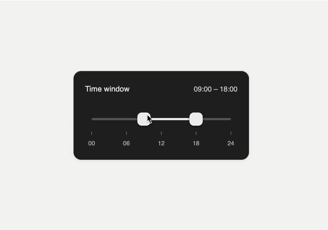
Time Window Slider
26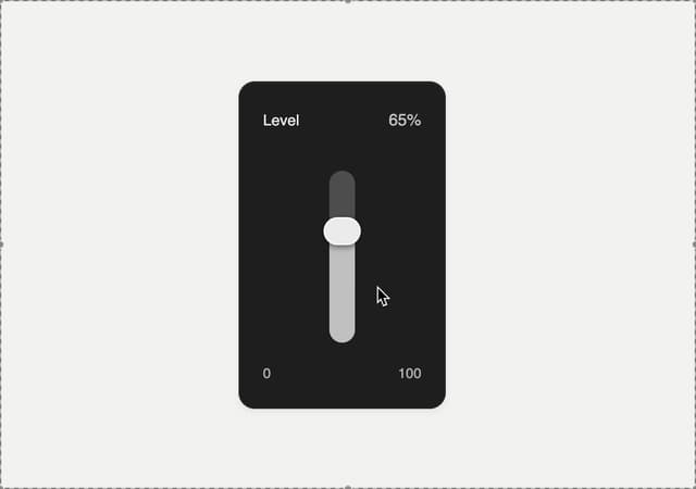
Matte Meter Slider
17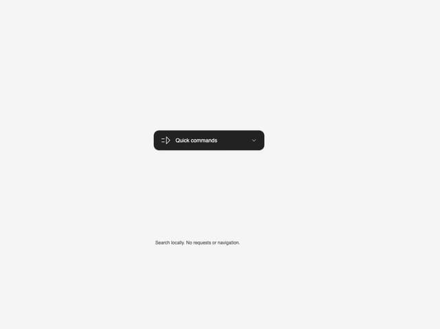
Commands Menu
15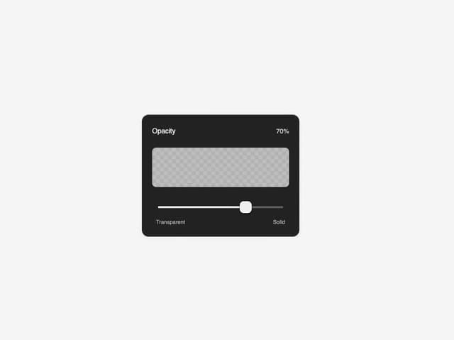
Matte Opacity Slider
13
Undo Feedback
9
More in Buttons
View all
Texture Button
104
Button
12
Native Button
27

Button
19
Button
78

HeroUI Button Group
5
Button
1

App Store Button
476


