
About
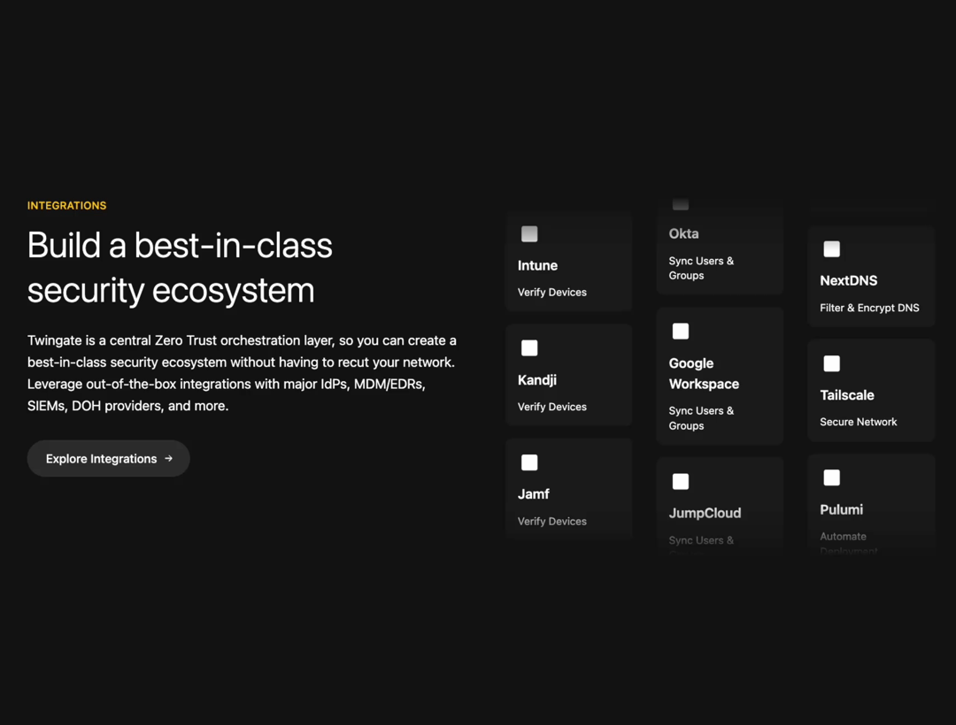
A section displaying technology integrations, featuring descriptive text, a call-to-action button with an arrow hover animation, and automatically scrolling cards presented in different layouts for mobile (horizontal) and desktop (vertical columns).
Built with React and Tailwind. Copy the prompt and paste it into Claude Code, Cursor or Lovable: your agent adds Animated Section to your project and fits it to your theme.
Code
How Animated Section is used: the demo's code. The component's own source comes with a free account.
Usage.tsx
// This is a demo of a preview
// That's what users will see in the preview

import { IntegrationsSection } from "@/components/ui/animated-section";

const DemoOne = () => {
  return (
    <div className="flex items-center  bg-[#141414] justify-center min-h-screen">
      <IntegrationsSection />
    </div>
  );
};

// IMPORTANT:
// format of the export MUST be export default { DemoOneOrOtherName }
// if you don't do this, the demo will not be shown
export default { DemoOne };
More by SO called
View all

Developer Sign-In Flow
3.2K
Interactive 3D Robot
2.1K
Animated Characters Login Page
1.6K
Interactive Galaxy Hero
1.4K
Product Mockup Section
1.3K
3D Boxes Hero
993
Expandable Content Card
990
AI Prompt Input
618
More in Features
View all

Grid Feature Cards
1.9K

Features Grid
83

Features 8
3.1K
Features Card
230

Feature Sections
189
Feature with image
151

Feature 72
131
Features 4
383

