
About
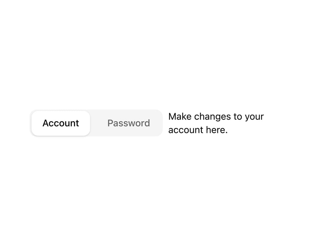
A tabs component with a Motion-powered sliding active indicator that animates between tab triggers, supporting default and underline (line) styles.
Built with React and Tailwind. Copy the prompt and paste it into Claude Code, Cursor or Lovable: your agent adds Animated Tabs to your project and fits it to your theme.
Code
How Animated Tabs is used: the demo's code. The component's own source comes with a free account.
Usage.tsx
"use client";

import { Tabs, TabsContent, TabsList, TabsTrigger } from "@/components/ui/tabs";

export default function TabsDemo() {
  return (
    <Tabs defaultValue="account" className="w-100">
      <TabsList>
        <TabsTrigger value="account">Account</TabsTrigger>
        <TabsTrigger value="password">Password</TabsTrigger>
      </TabsList>
      <TabsContent value="account">
        Make changes to your account here.
      </TabsContent>
      <TabsContent value="password">Change your password here.</TabsContent>
    </Tabs>
  );
}
Dependencies
More by sopo
View all
Hover Card
2
Animated Select
Sheet

Icon Toggle
Animated Dialog
More in Navigation
View all

Liquid Glass Expandable Sidebar
89

Footer with Big Wordmark
45

Sidebar
395

Oversized 404 Numeral
78
Menu
8

NavBar
2
Navbar with Theme Toggle
67

Pagination
1
