
About
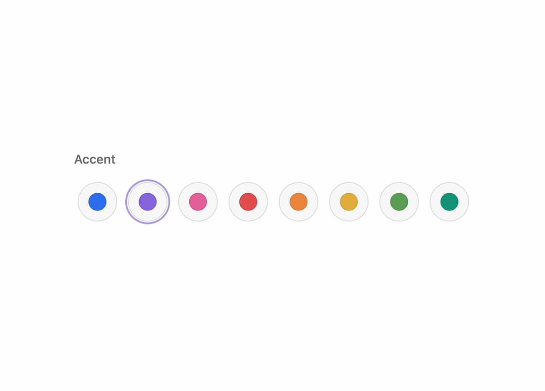
A radio-group style color swatch picker with a spring-animated selection ring, press feedback, and full keyboard navigation, used for choosing an accent color or theme option.
Built with React and Tailwind. Copy the prompt and paste it into Claude Code, Cursor or Lovable: your agent adds Animated Color Selector to your project and fits it to your theme.
Code
How Animated Color Selector is used: the demo's code. The component's own source comes with a free account.
Usage.tsx
import {
  ColorSelector,
  ColorSelectorItem,
  ColorSelectorLabel,
  ColorSelectorList,
} from "@/components/ui/color-selector";

export default function ColorSelectorPreview() {
  return (
    <ColorSelector defaultValue="blue" name="accent">
      <ColorSelectorLabel>Accent</ColorSelectorLabel>
      <ColorSelectorList>
        <ColorSelectorItem value="blue" color="#3478f6" label="Blue" />
        <ColorSelectorItem value="purple" color="#9270e8" label="Purple" />
        <ColorSelectorItem value="pink" color="#e66aa4" label="Pink" />
        <ColorSelectorItem value="red" color="#e55656" label="Red" />
        <ColorSelectorItem value="orange" color="#ed9141" label="Orange" />
        <ColorSelectorItem value="amber" color="#e5b63c" label="Amber" />
        <ColorSelectorItem value="green" color="#65a65a" label="Green" />
        <ColorSelectorItem value="teal" color="#169d83" label="Teal" />
      </ColorSelectorList>
    </ColorSelector>
  );
}