
About
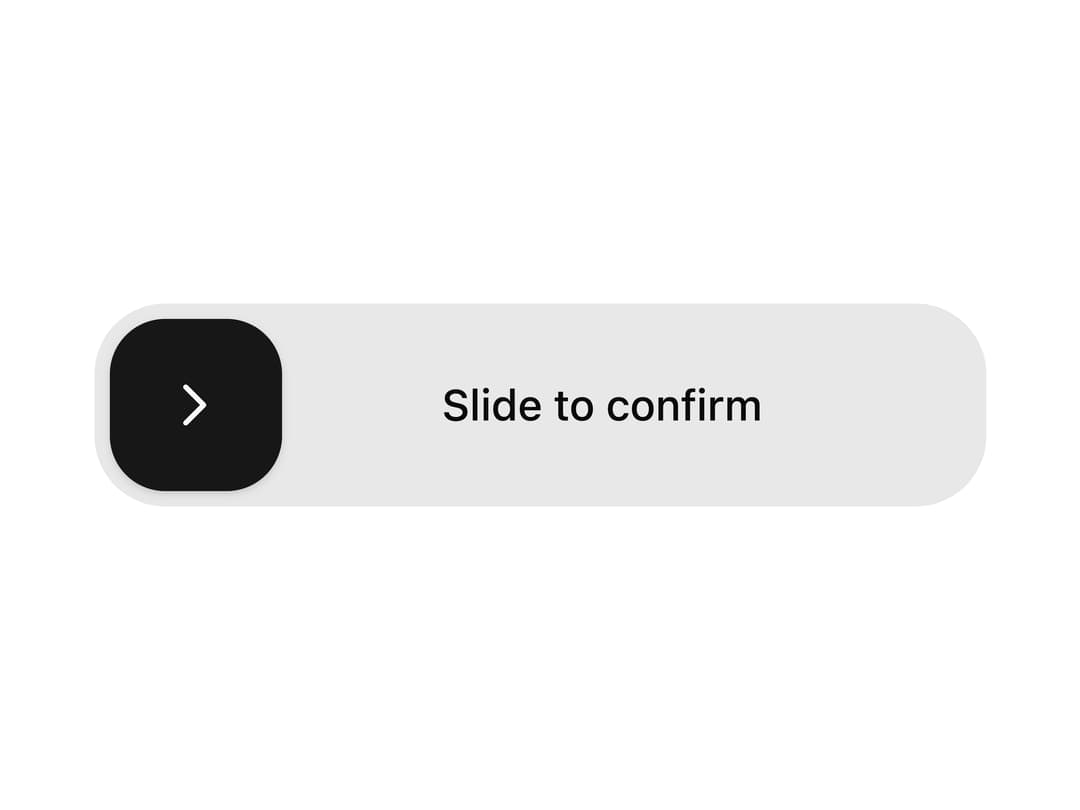
A draggable slider button that requires the user to drag its thumb to the end to confirm an action, springing back if released too early.
Built with React and Tailwind. Copy the prompt and paste it into Claude Code, Cursor or Lovable: your agent adds Slide Action Button to your project and fits it to your theme.
Code
How Slide Action Button is used: the demo's code. The component's own source comes with a free account.
Usage.tsx
import SlideActionButton from "@/components/ui/slide-action-button";

export default function SlideActionButtonDemo() {
  return (
    <div className="flex min-h-screen w-full items-center justify-center bg-background p-8">
      <SlideActionButton
        completeLabel="Confirmed"
        onComplete={() => console.log("confirmed")}
      >
        Slide to confirm
      </SlideActionButton>
    </div>
  );
}
Dependencies
More by Saurabh
View all
BeUI Tilt Card
378
BeUI Expandable Tabs
353
BeUI File Upload
297
Animated Sidebar
225
BeUI Bouncy Accordion
209
BeUI Create Menu
201
BeUI Expanable Action Bar
197
Loader
191
More in Buttons
View all
Texture Button
98

Button
34

HeroUI Button Group


Eclipse Button
40

Button
49
Base Button
4
Button


App Store Button
464

