
About
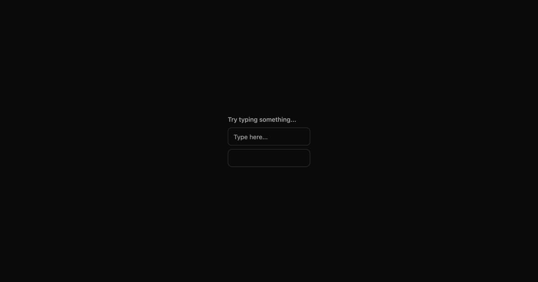
Input field with floating label and password visibility toggle.
Built with React and Tailwind. Copy the prompt and paste it into Claude Code, Cursor or Lovable: your agent adds Label Input to your project and fits it to your theme.
Code
How Label Input is used: the demo's code. The component's own source comes with a free account.
Usage.tsx
import LabelInput from "@/components/ui/label-input"

export default function LabelInputDemo() {
  return (
    <div className="flex flex-col items-center justify-center min-h-[400px] gap-4 p-8">
      <label className="flex flex-col gap-2 w-full max-w-sm">
        <span className="text-sm font-medium text-muted-foreground">Try typing something...</span>
        <input
          type="text"
          placeholder="Type here..."
          className="flex h-10 w-full rounded-md border border-input bg-background px-3 py-2 text-base ring-offset-background file:border-0 file:bg-transparent file:text-sm file:font-medium file:text-foreground placeholder:text-muted-foreground focus-visible:outline-none focus-visible:ring-2 focus-visible:ring-ring focus-visible:ring-offset-2 disabled:cursor-not-allowed disabled:opacity-50 md:text-sm"
        />
        <LabelInput

        />
      </label>
    </div>
  )
}
Dependencies
More by tom
View all

Shimmer Text
1.1K
Special Text
1.1K
Animated Gradient
1.1K
Tilt Card
901
Marquee
796
Text Marquee
753
QR Code
476
Animated Checkbox
393
More in Forms
View all

Form
18

Premium Auth
570

Login 1
63

Contact Card
1.1K

Book A Demo 1
91
Book A Demo 3
102

Card Studio
47

Login Card
35