
About
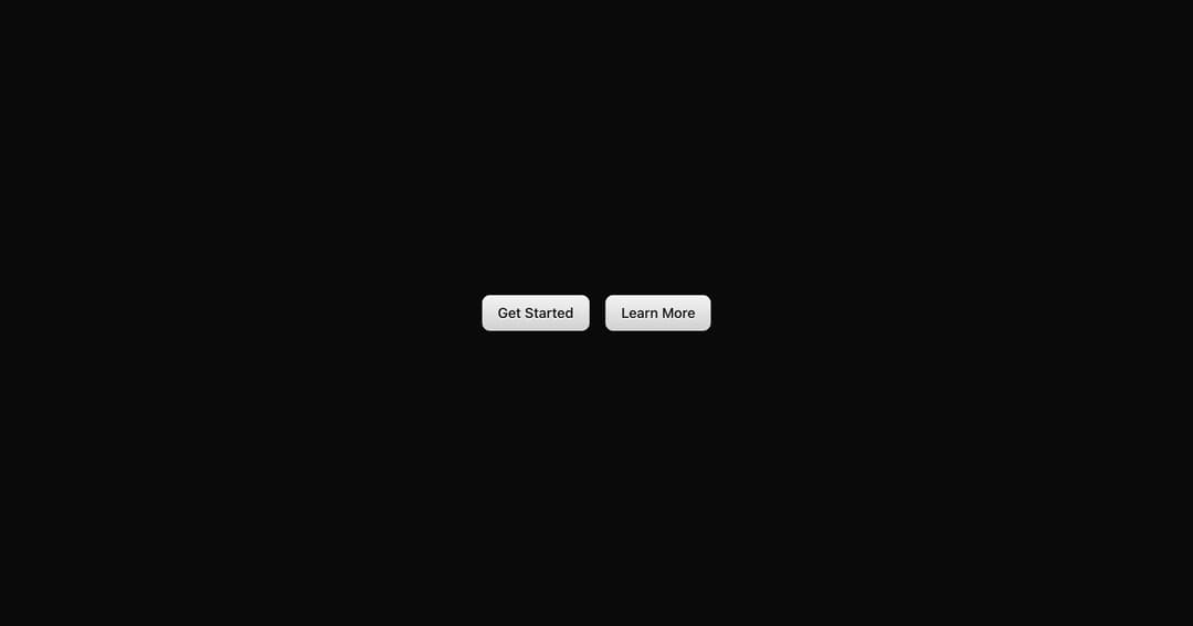
A button component with rich styling and color variants.
Built with React and Tailwind. Copy the prompt and paste it into Claude Code, Cursor or Lovable: your agent adds Rich Button to your project and fits it to your theme.
Code
How Rich Button is used: the demo's code. The component's own source comes with a free account.
Usage.tsx
import { RichButton } from "@/components/ui/rich-button"

export default function Demo() {
  return (
    <div className="flex items-center justify-center min-h-[400px] gap-4 p-8">
      <RichButton>Get Started</RichButton>
      <RichButton variant="secondary">Learn More</RichButton>
    </div>
  )
}
Dependencies
More by tom
View all

Shimmer Text
1.1K
Special Text
1.1K
Animated Gradient
1.1K
Tilt Card
900
Marquee
795
Text Marquee
752
QR Code
474
Animated Checkbox
392
More in Buttons
View all
Button
12

Notification Button
115
Texture Button
105

HeroUI Button Group
2

App Store Button
482
Split Button
16
Button
78

Base Button
1


