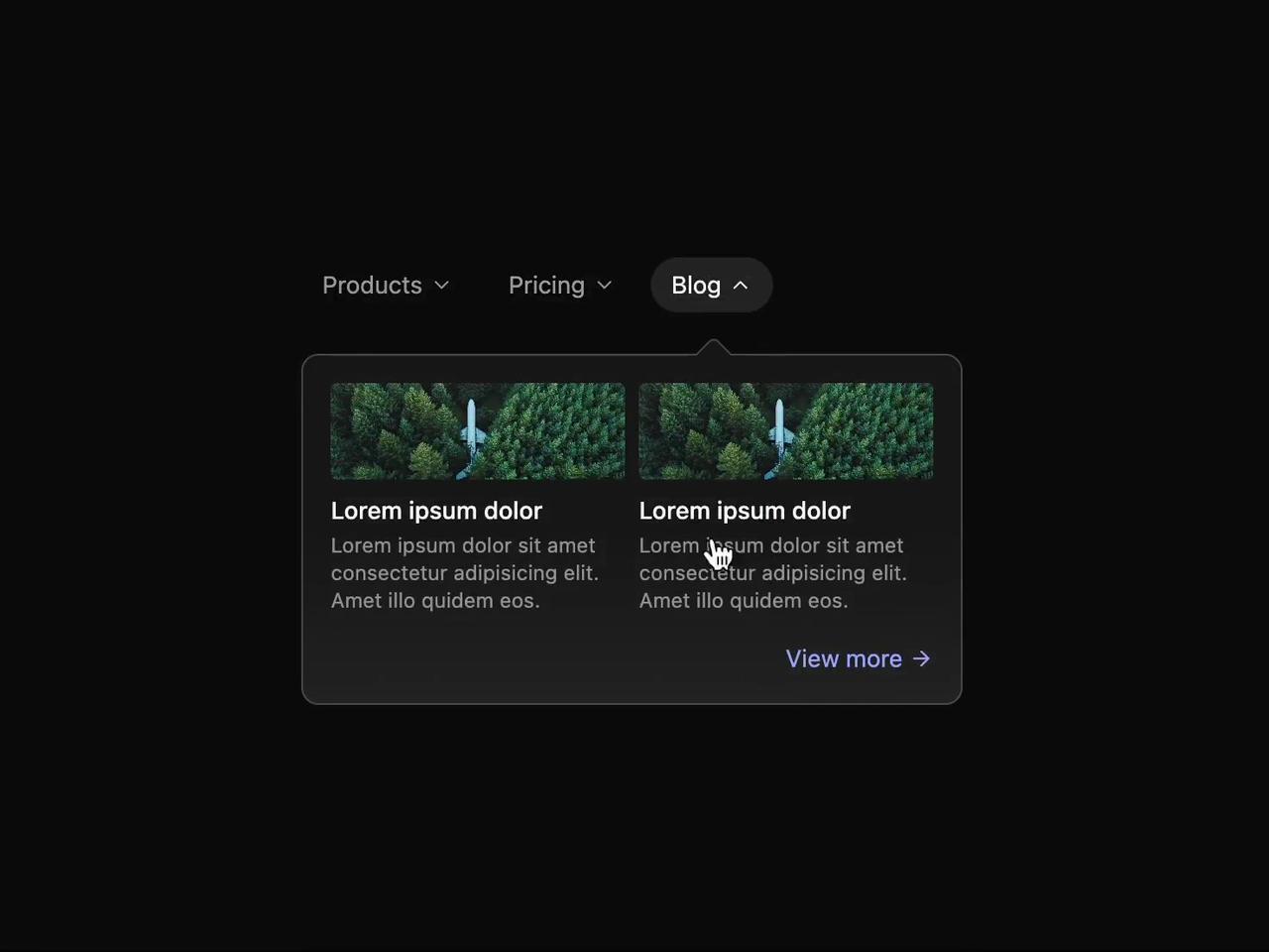
This code implements a reusable React component that creates an animated tabbed interface with a shifting content overlay. It addresses the need for a visually engaging and interactive way to present different sections of content, such as product details, pricing plans, or blog posts. The component uses several libraries to achieve this: React for the core UI, Framer Motion for animations, and React Icons for providing visual elements.
Here's a step-by-step breakdown:
ShiftingDropDown Component: This is the main container, holding the Tabs component.Tabs Component: This manages the selected tab state using useState hooks for selected (the currently selected tab index) and dir (direction of animation, 'l' or 'r'). The handleSetSelected function updates these states based on mouse events, determining the animation direction.Tab Component: Each tab is rendered as a button. The styling changes based on whether it's selected, using CSS classes and the selected prop. The FiChevronDown icon animates on selection.Content Component: This displays the content for the selected tab. AnimatePresence ensures smooth entrance and exit animations for the content using Framer Motion's initial, animate, and exit properties. The motion.div smoothly animates the content's position based on the dir prop (left or right).Bridge Component: A simple visual element that creates a bridge connecting the tab to the content.Nub Component: This dynamically positioned element visually points to the selected tab. useEffect and getBoundingClientRect are used to calculate its position relative to the selected tab.- Content Components (
Products, Pricing, Blog): These components render the actual content for each tab, using basic HTML elements and styling.
TABS Array: This array defines the data for each tab, mapping titles to their corresponding content components.
Example Scenarios:
- Displaying product features, pricing tiers, or blog posts.
- Creating an interactive FAQ section.
- Presenting different views or options within a dashboard.
- Implementing a step-by-step guide or tutorial.
The component leverages the power of React's state management and Framer Motion's animation capabilities to create a polished and user-friendly experience. The use of CSS classes and inline styles allows for easy customization and theming.