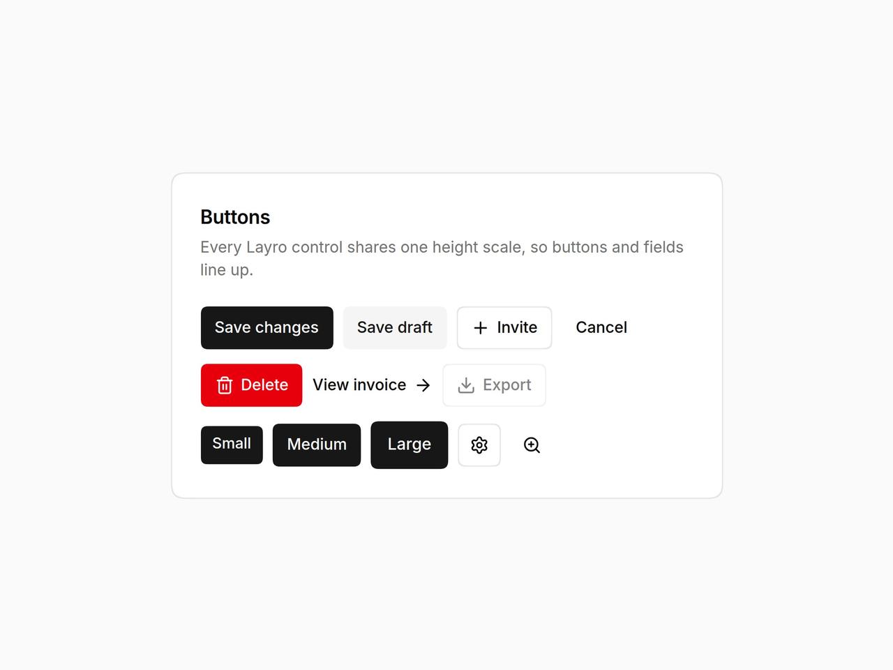
import * as React from "react";
import { Button, IconButton } from "@/components/ui/layro-button";
import { ArrowRight, Download, Plus, Settings, Trash2, ZoomIn } from "lucide-react";

/* Six variants, three sizes, and a loading state that keeps its width.
   Press "Save changes": the label stays in the layout while the spinner
   runs, so nothing beside it moves. Icon buttons insist on a label. */

export default function ButtonDemo() {
  const [saving, setSaving] = React.useState(false);
  const save = () => { setSaving(true); setTimeout(() => setSaving(false), 1400); };
  return (
    <div className="flex min-h-screen w-full items-center justify-center bg-background p-6">
      <div className="w-full min-w-0 rounded-[18px] [corner-shape:squircle] bg-card p-6 text-card-foreground ring-1 ring-border" style={{ maxWidth: 460 }}>
        <h2 className="text-[16px] font-semibold tracking-[-0.01em]">Buttons</h2>
        <p className="mt-1 mb-5 text-[13px] text-muted-foreground">Every Layro control shares one height scale, so buttons and fields line up.</p>
        <div className="flex flex-wrap items-center gap-2">
          <Button loading={saving} onClick={save}>Save changes</Button>
          <Button variant="secondary">Save draft</Button>
          <Button variant="outline"><Plus /> Invite</Button>
          <Button variant="ghost">Cancel</Button>
        </div>
        <div className="mt-3 flex flex-wrap items-center gap-2">
          <Button variant="destructive"><Trash2 /> Delete</Button>
          <Button variant="link">View invoice <ArrowRight /></Button>
          <Button variant="outline" disabled><Download /> Export</Button>
        </div>
        <div className="mt-3 flex flex-wrap items-center gap-2">
          <Button size="sm">Small</Button>
          <Button>Medium</Button>
          <Button size="lg">Large</Button>
          <IconButton label="Settings" variant="outline"><Settings /></IconButton>
          <IconButton label="Zoom in"><ZoomIn /></IconButton>
        </div>
      </div>
    </div>
  );
}