import * as React from "react";
import { Field, Select, SelectItem } from "@/components/ui/layro-select";

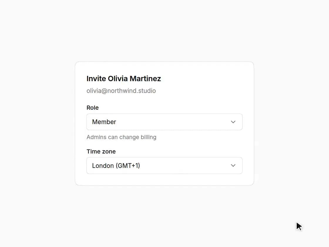
/* A Radix select with a hint line under each option, so a role picker
   explains itself. Typeahead and arrow keys work; the list sits against the
   trigger and flips when there is no room. */

export default function SelectDemo() {
  return (
    <div className="flex min-h-screen w-full items-center justify-center bg-background p-6">
      <div className="w-full min-w-0 rounded-[18px] [corner-shape:squircle] bg-card p-6 text-card-foreground ring-1 ring-border" style={{ maxWidth: 380 }}>
        <h2 className="text-[16px] font-semibold tracking-[-0.01em]">Invite Olivia Martinez</h2>
        <p className="mt-1 mb-5 text-[13px] text-muted-foreground">olivia@northwind.studio</p>
        <div className="grid gap-4">
          <Field label="Role" hint="Admins can change billing">
            <Select defaultValue="member" placeholder="Choose a role">
              <SelectItem value="admin" hint="Everything but ownership">Admin</SelectItem>
              <SelectItem value="member" hint="Edit and comment">Member</SelectItem>
              <SelectItem value="viewer" hint="Read only">Viewer</SelectItem>
              <SelectItem value="guest" disabled>Guest</SelectItem>
            </Select>
          </Field>
          <Field label="Time zone">
            <Select defaultValue="london">
              <SelectItem value="london">London (GMT+1)</SelectItem>
              <SelectItem value="kolkata">Kolkata (GMT+5:30)</SelectItem>
              <SelectItem value="ny">New York (GMT-4)</SelectItem>
            </Select>
          </Field>
        </div>
      </div>
    </div>
  );
}