
About
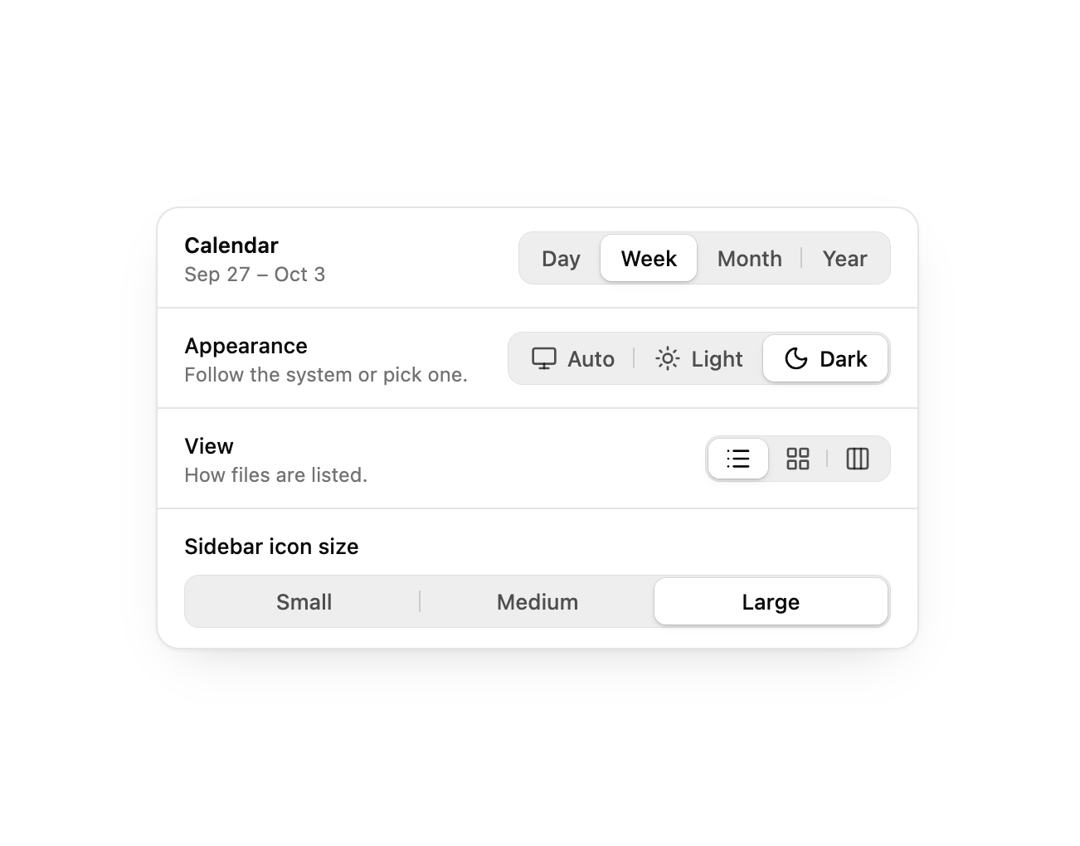
A macOS-style segmented control for switching between a few mutually exclusive options, with a selected pill that springs between segments and hairline dividers between unselected ones.
Built with React and Tailwind. Copy the prompt and paste it into Claude Code, Cursor or Lovable: your agent adds Segmented Control to your project and fits it to your theme.
Code
How Segmented Control is used: the demo's code. The component's own source comes with a free account.
Usage.tsx
"use client";

import * as React from "react";
import * as LucideIcons from "lucide-react";

import {
  SegmentedControl,
  SegmentedControlItem,
} from "@/components/ui/segmented-control";

const ranges = {
  day: "Tuesday, Sep 29",
  week: "Sep 27 – Oct 3",
  month: "September 2026",
  year: "2026",
} as const;

export default function SegmentedControlDemo() {
  const [range, setRange] = React.useState<keyof typeof ranges>("week");

  return (
    <div className="w-full max-w-[460px] overflow-hidden rounded-xl border bg-card text-card-foreground shadow-[0_1px_2px_rgb(0_0_0/0.04),0_12px_32px_-16px_rgb(0_0_0/0.2)]">
      <div className="flex flex-wrap items-center justify-between gap-3 border-b px-4 py-3">
        <div className="min-w-0">
          <p className="text-[13px] font-semibold">Calendar</p>
          <p className="text-xs text-muted-foreground tabular-nums">
            {ranges[range]}
          </p>
        </div>
        <SegmentedControl
          aria-label="Range"
          value={range}
          onValueChange={(v) => setRange(v as keyof typeof ranges)}
        >
          <SegmentedControlItem value="day">Day</SegmentedControlItem>
          <SegmentedControlItem value="week">Week</SegmentedControlItem>
          <SegmentedControlItem value="month">Month</SegmentedControlItem>
          <SegmentedControlItem value="year">Year</SegmentedControlItem>
        </SegmentedControl>
      </div>

      <div className="divide-y">
        <div className="flex flex-wrap items-center justify-between gap-3 px-4 py-3">
          <div>
            <p className="text-[13px] font-medium">Appearance</p>
            <p className="text-xs text-muted-foreground">
              Follow the system or pick one.
            </p>
          </div>
          <SegmentedControl aria-label="Appearance" defaultValue="auto">
            <SegmentedControlItem value="auto">
              <LucideIcons.Monitor aria-hidden="true" />
              Auto
            </SegmentedControlItem>
            <SegmentedControlItem value="light">
              <LucideIcons.Sun aria-hidden="true" />
              Light
            </SegmentedControlItem>
            <SegmentedControlItem value="dark">
              <LucideIcons.Moon aria-hidden="true" />
              Dark
            </SegmentedControlItem>
          </SegmentedControl>
        </div>
        <div className="flex flex-wrap items-center justify-between gap-3 px-4 py-3">
          <div>
            <p className="text-[13px] font-medium">View</p>
            <p className="text-xs text-muted-foreground">
              How files are listed.
            </p>
          </div>
          <SegmentedControl aria-label="View" defaultValue="grid" size="sm">
            <SegmentedControlItem
              value="list"
              aria-label="List"
              className="px-2.5"
            >
              <LucideIcons.List aria-hidden="true" />
            </SegmentedControlItem>
            <SegmentedControlItem
              value="grid"
              aria-label="Icons"
              className="px-2.5"
            >
              <LucideIcons.LayoutGrid aria-hidden="true" />
            </SegmentedControlItem>
            <SegmentedControlItem
              value="columns"
              aria-label="Columns"
              className="px-2.5"
            >
              <LucideIcons.Columns3 aria-hidden="true" />
            </SegmentedControlItem>
          </SegmentedControl>
        </div>
        <div className="px-4 py-3">
          <p className="mb-2 text-[13px] font-medium">Sidebar icon size</p>
          <SegmentedControl
            aria-label="Sidebar icon size"
            defaultValue="medium"
            fullWidth
          >
            <SegmentedControlItem value="small">Small</SegmentedControlItem>
            <SegmentedControlItem value="medium">Medium</SegmentedControlItem>
            <SegmentedControlItem value="large">Large</SegmentedControlItem>
          </SegmentedControl>
        </div>
      </div>
    </div>
  );
}