
About
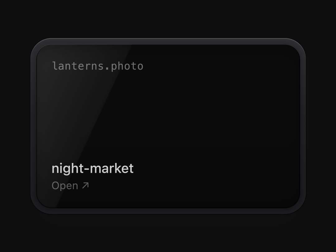
A dark glass bezel-and-screen frame (with a glare, shaded rim and inner shadow) used to display a link preview, code block, or image behind glass.
Built with React and Tailwind. Copy the prompt and paste it into Claude Code, Cursor or Lovable: your agent adds Glass Face to your project and fits it to your theme.
Code
How Glass Face is used: the demo's code. The component's own source comes with a free account.
Usage.tsx
import GlassFace from "@/components/ui/glass-face";

export default function GlassFaceDemo() {
  return (
    <div className="w-full h-screen flex items-center justify-center bg-[#0E0E0F]">
      <GlassFace.Root className="w-72">
        <GlassFace.Screen className="aspect-[16/10] flex flex-col justify-between p-4">
          <span className="text-[11px] font-mono tracking-wide text-white/40">
            lanterns.photo
          </span>
          <div>
            <p className="text-sm font-medium text-white/90">night-market</p>
            <p className="text-[11px] text-white/40">Open ↗</p>
          </div>
        </GlassFace.Screen>
      </GlassFace.Root>
    </div>
  );
}
More by vijayksingh
View all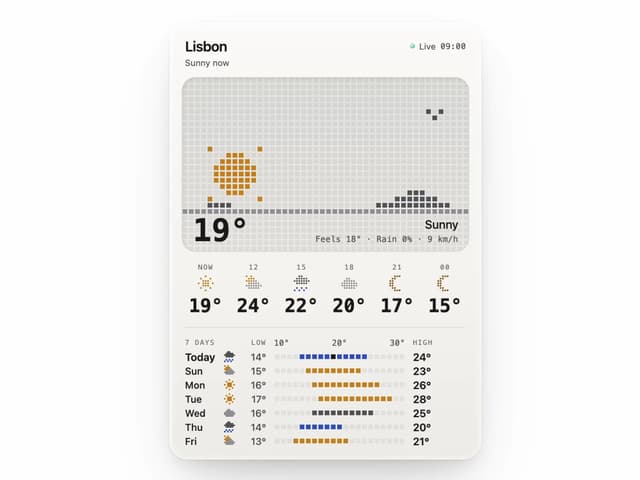
Weather Widget
74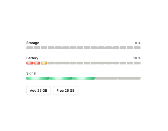
Meter
10
Skeleton Loader
9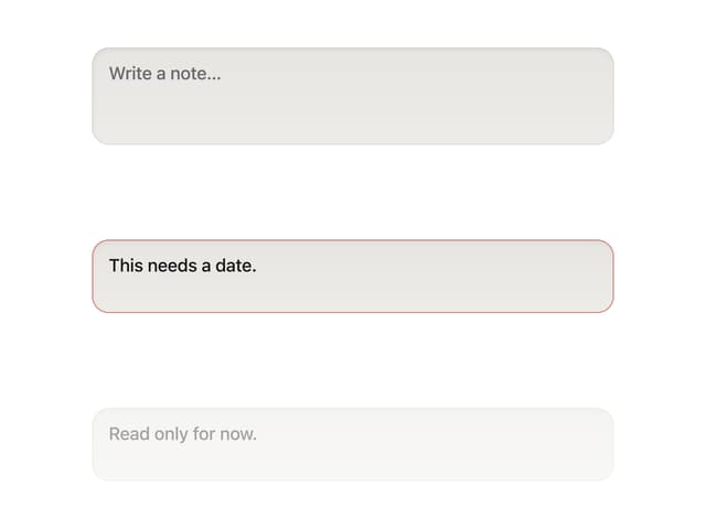
Textarea
2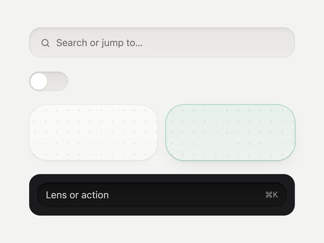
Well
1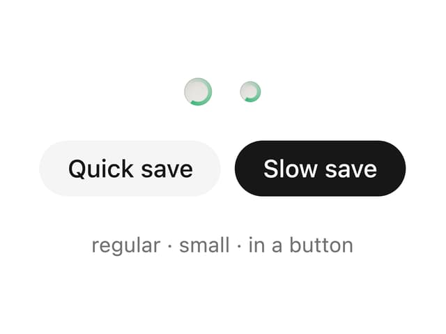
Soft Hardware Spinner
1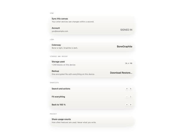
Settings List
Perfect Preview
More in Cards
View all

Statistics Card 2
263
Stats cards with links
39
Card
70

Course Design Cards
1.1K
The Item one
3

Card Studio
7
Statistics Card 7
291

Item
10
