
About
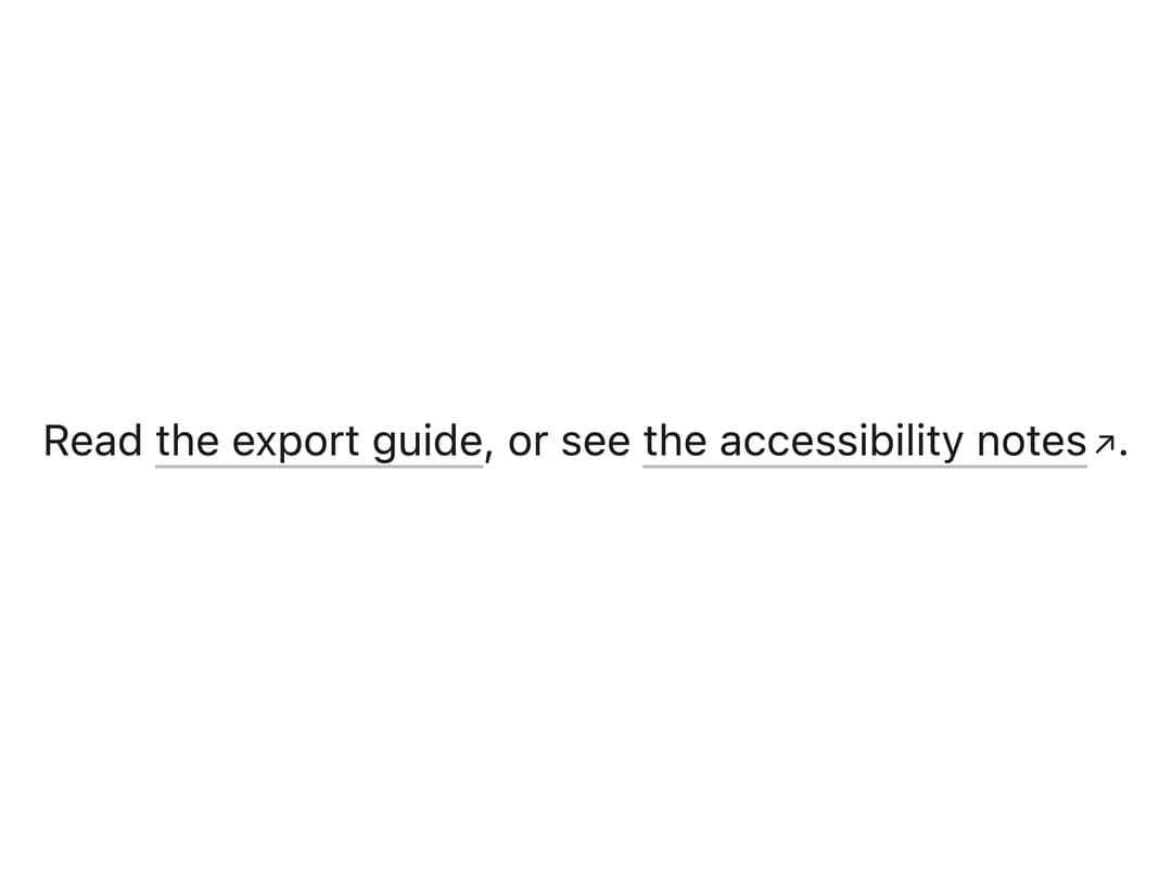
An inline text link that is always underlined with a subtle engraved hairline which darkens on hover, with an optional arrow and new-tab announcement for links that leave the site.
Built with React and Tailwind. Copy the prompt and paste it into Claude Code, Cursor or Lovable: your agent adds Link to your project and fits it to your theme.
Code
How Link is used: the demo's code. The component's own source comes with a free account.
Usage.tsx
import { Link } from "@/components/ui/link";

export default function LinkDemo() {
  return (
    <div
      className="flex max-w-md items-center justify-center p-8"
      style={{ color: "var(--mu-ink)" }}
    >
      <p className="text-[13.5px] leading-5">
        Read <Link href="/guides/export">the export guide</Link>, or see{" "}
        <Link href="https://www.w3.org/WAI/" external>
          the accessibility notes
        </Link>
        .
      </p>
    </div>
  );
}
Dependencies
More by vijayksingh
View all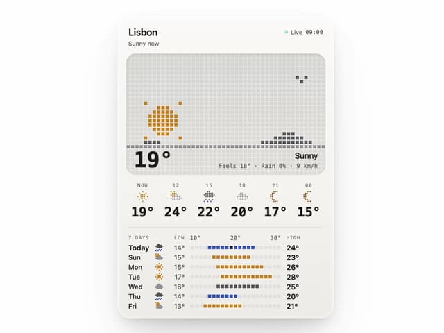
Weather Widget
74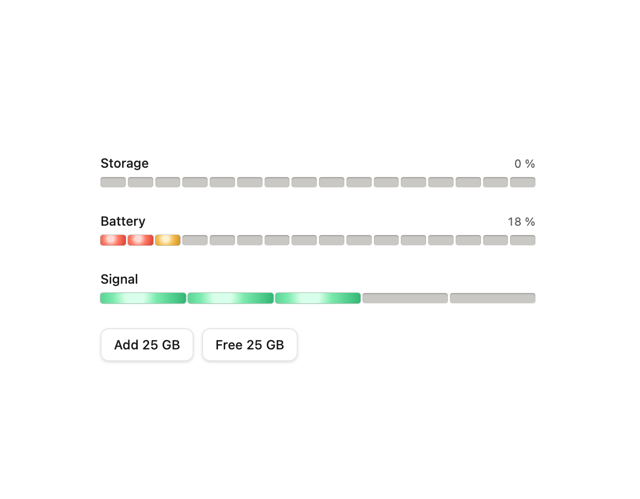
Meter
10
Skeleton Loader
9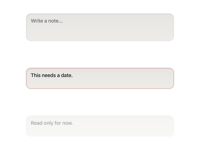
Textarea
2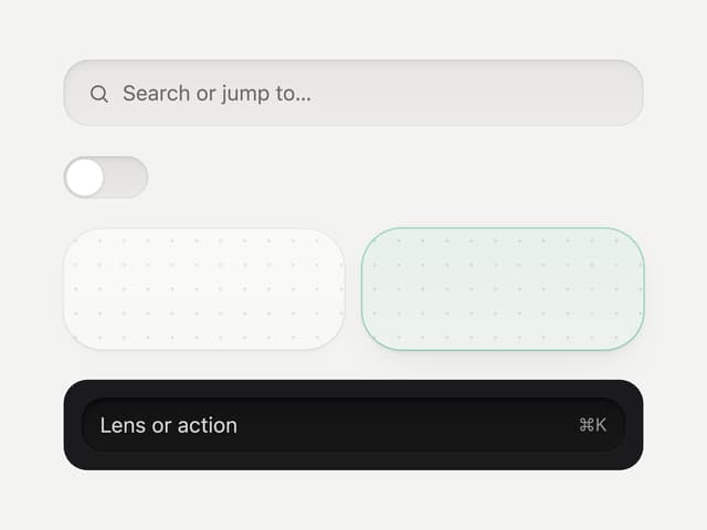
Well
1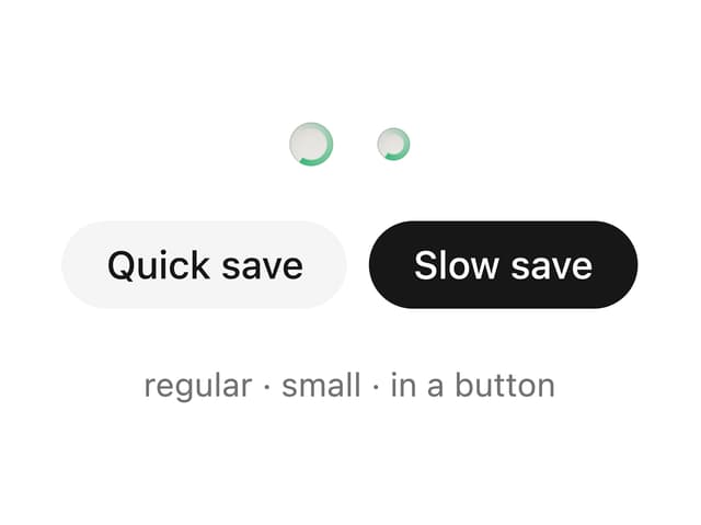
Soft Hardware Spinner
1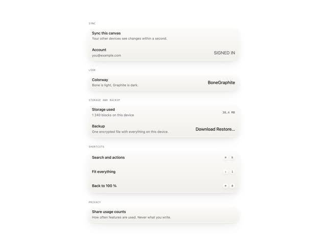
Settings List
Perfect Preview