
About
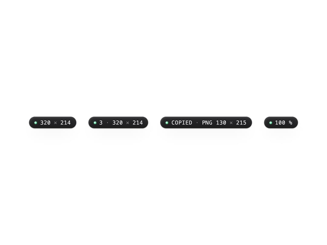
A small graphite pill that displays a measured value — an object's width/height, a multi-selection count, a "copied" confirmation, or a zoom percentage — with a live status LED beside it.
Built with React and Tailwind. Copy the prompt and paste it into Claude Code, Cursor or Lovable: your agent adds Size Readout to your project and fits it to your theme.
Code
How Size Readout is used: the demo's code. The component's own source comes with a free account.
Usage.tsx
import { SizeReadout } from "@/components/ui/size-readout";

export default function SizeReadoutDemo() {
  return (
    <div className="flex flex-wrap items-center justify-center gap-6 p-10">
      <SizeReadout width={320} height={214} />
      <SizeReadout width={320} height={214} count={3} />
      <SizeReadout width={130} height={215} copied="PNG" />
      <SizeReadout value="100 %" aria-label="Zoom 100 percent" />
    </div>
  );
}
More by vijayksingh
View all
Weather Widget
72
Meter
10
Skeleton Loader
8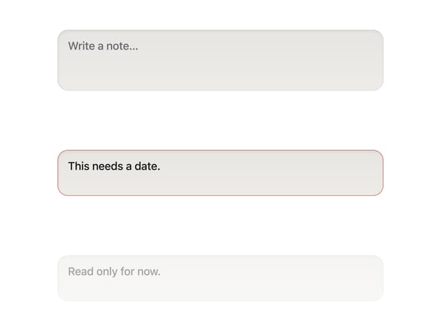
Textarea
2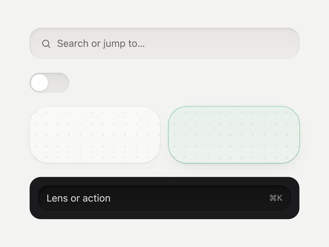
Well
1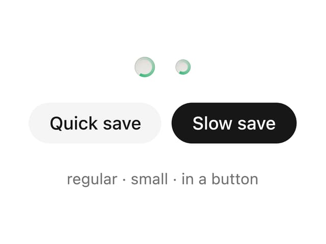
Soft Hardware Spinner
1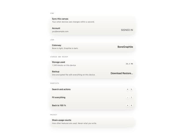
Settings List
Perfect Preview