
About
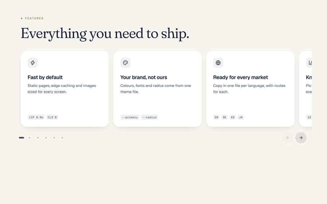
A row of cards you swipe through, snapping card by card, with dots and arrows. Pass gridFrom and the same cards become a grid on wider screens: one markup for phone and desktop. From the Midnight template.
Built with React and Tailwind. Copy the prompt and paste it into Claude Code, Cursor or Lovable: your agent adds Card Carousel to Grid to your project and fits it to your theme.
Code
How Card Carousel to Grid is used: the demo's code. The component's own source comes with a free account.
Usage.tsx
import type { CSSProperties, ReactNode } from "react"
import { BarChart3, Globe, Lock, Palette, Rocket, Zap } from "lucide-react"

import { SwipeCarousel } from "@/components/ui/swipe-carousel"

const fonts =
  "@import url('https://fonts.googleapis.com/css2?family=Fraunces:ital,opsz,wght,SOFT@0,9..144,300..600,0..100;1,9..144,300..600,0..100&family=Geist:wght@400..600&family=Geist+Mono:wght@400..500&display=swap');"

const settings = {
  label: "Features",
  title: "Everything you need to ship.",
  arrows: true,
  background: "#f7f5f0",
  card: "#ffffff",
  text: "#141a2e",
  muted: "#4a5166",
  primary: "#a8803a",
}

// Midnight by day as theme tokens: warm paper, night-blue ink, deep gold with white text on it,
// Fraunces for headings, Geist for text, Geist Mono for figures. The component itself only reads the tokens.
function day(s: typeof settings) {
  const t: Record<string, string> = {
    background: s.background,
    foreground: s.text,
    card: s.card,
    primary: s.primary,
    "muted-foreground": s.muted,
    ring: s.primary,
  }
  return {
    ...Object.fromEntries(Object.entries(t).flatMap(([k, v]) => [[`--${k}`, v], [`--color-${k}`, v]])),
    "--font-display": "Fraunces, ui-serif, Georgia, serif",
    "--font-sans": "Geist, ui-sans-serif, system-ui, sans-serif",
    "--font-mono": "'Geist Mono', ui-monospace, Menlo, monospace",
  } as CSSProperties
}

function Card({ s, icon, title, text, foot }: { s: typeof settings; icon: ReactNode; title: string; text: string; foot: ReactNode }) {
  return (
    <div
      className="flex h-full min-h-[300px] flex-col rounded-[24px] p-7"
      style={{ background: s.card, boxShadow: "inset 0 0 0 1px rgb(20 26 46 / 0.07), 0 1px 2px rgb(20 26 46 / 0.05), 0 16px 32px -20px rgb(20 26 46 / 0.22)" }}
    >
      <span className="grid size-10 place-items-center rounded-xl [&_svg]:size-5" style={{ background: "rgb(20 26 46 / 0.06)", color: s.text }}>
        {icon}
      </span>
      <h3 className="mt-6 text-[20px] leading-[26px] font-semibold tracking-[-0.02em]">{title}</h3>
      <p className="mt-2 text-[15px] leading-6" style={{ color: s.muted }}>
        {text}
      </p>
      <div aria-hidden="true" className="mt-auto flex items-center gap-1.5 pt-8 text-[13px]" style={{ color: s.muted }}>
        {foot}
      </div>
    </div>
  )
}

const chip = (t: string) => (
  <span key={t} className="rounded-md px-1.5 py-0.5 text-[11.5px]" style={{ background: "rgb(20 26 46 / 0.06)", fontFamily: "'Geist Mono', ui-monospace, Menlo, monospace" }}>
    {t}
  </span>
)

export default function Demo(props: Partial<typeof settings>) {
  const s = { ...settings, ...props }
  const i = { strokeWidth: 1.75 }
  return (
    <div
      className="flex min-h-svh w-full justify-center overflow-x-clip px-6 py-16"
      style={{ ...day(s), fontFamily: "Geist, ui-sans-serif, system-ui, sans-serif", background: s.background, color: s.text } as CSSProperties}
    >
      <style>{fonts}</style>
      <div className="w-full max-w-[1120px]">
        <p className="flex items-center gap-2 text-[12px] leading-4 tracking-[0.16em] uppercase" style={{ fontFamily: "var(--font-mono)", color: "#8a6a2e" }}>
          <svg viewBox="-6 -6 12 12" className="size-2.5" aria-hidden="true">
            <path d="M0 -6Q0 0 6 0Q0 0 0 6Q0 0 -6 0Q0 0 0 -6Z" fill="currentColor" />
          </svg>
          {s.label}
        </p>
        <h2
          className="mt-5 text-[40px] leading-[1.04] font-[350] tracking-[-0.02em] text-balance md:text-[56px] max-w-[720px]"
          style={{ fontFamily: "var(--font-display)", fontVariationSettings: '"SOFT" 50' }}
        >
          {s.title}
        </h2>
        <SwipeCarousel label="Feature" arrows={s.arrows} className="mt-10">
          <Card s={s} icon={<Zap {...i} />} title="Fast by default" text="Static pages, edge caching and images sized for every screen." foot={<>{["LCP 0.9s", "CLS 0"].map(chip)}</>} />
          <Card s={s} icon={<Palette {...i} />} title="Your brand, not ours" text="Colours, fonts and radius come from one theme file." foot={<>{["--primary", "--radius"].map(chip)}</>} />
          <Card s={s} icon={<Globe {...i} />} title="Ready for every market" text="Copy in one file per language, with routes for each." foot={<>{["EN", "DE", "ES", "JA"].map(chip)}</>} />
          <Card s={s} icon={<BarChart3 {...i} />} title="Know what works" text="Pick an analytics tool in one setting; the events are already wired." foot={<>{["12 events"].map(chip)}</>} />
          <Card s={s} icon={<Lock {...i} />} title="Private by design" text="No trackers until you add one, and no cookies you did not ask for." foot={<>{["0 cookies"].map(chip)}</>} />
          <Card s={s} icon={<Rocket {...i} />} title="Ship today" text="One command builds a static site you can host anywhere." foot={<>{["npm run build"].map(chip)}</>} />
        </SwipeCarousel>
      </div>
    </div>
  )
}
Dependencies
More by Vilqor
View all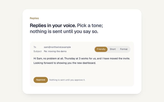

AI Email Reply with Tones
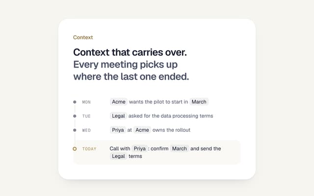
AI Memory Timeline
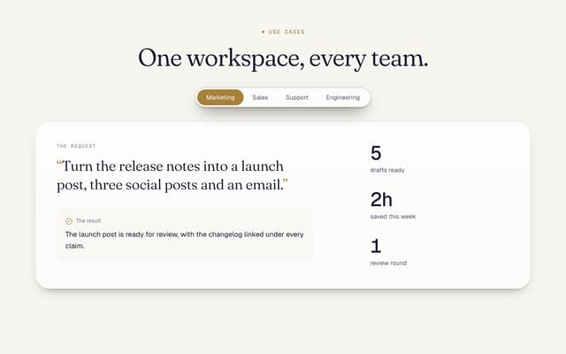
Use Cases Tabs Section
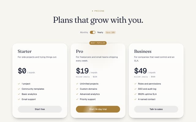
Pricing Section with Toggle
Logo Cloud Marquee
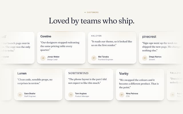
Testimonials Marquee

AI Agent Workflow Diagram
Footer with Big Wordmark
More in Cards
View all
Stats cards with links
36

Course Design Cards
1.2K

Statistics Card 2
298

Interactive Tech Stack Bento Grid with Hover Effects
534
Statistics Card 7
320

Card Studio
37
Statistics Card 10
289
The Item one
3
