
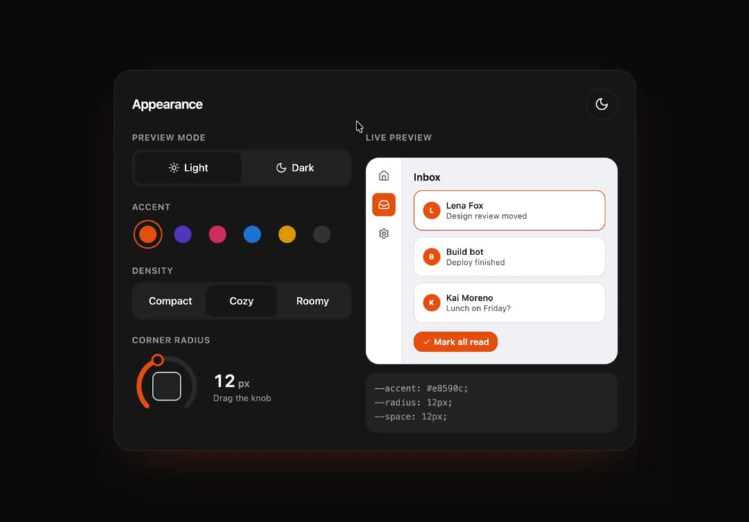
About
Appearance settings: preview mode, accent swatches, density and a corner radius rotary dial. A live mini inbox window re-lays out with layout animations; accent clicks release a color bloom from the swatch. Outputs the generated CSS variables live; built-in light/dark toggle for the panel itself.
Built with React and Tailwind. Copy the prompt and paste it into Claude Code, Cursor or Lovable: your agent adds Appearance Lab to your project and fits it to your theme.
Code
How Appearance Lab is used: the demo's code. The component's own source comes with a free account.
Usage.tsx
import * as React from "react"
import { AppearanceLab } from "@/components/ui/st-appearance-lab"

export default function AppearanceLabDemo() {
  return <AppearanceLab />
}
Dependencies
More by Holo
View all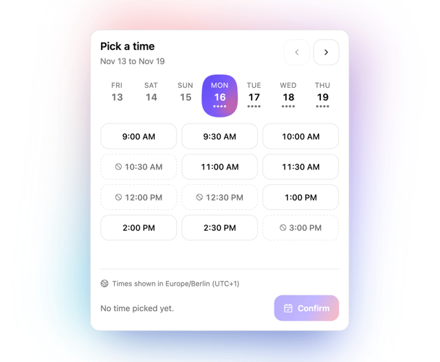

Slot Week Picker
26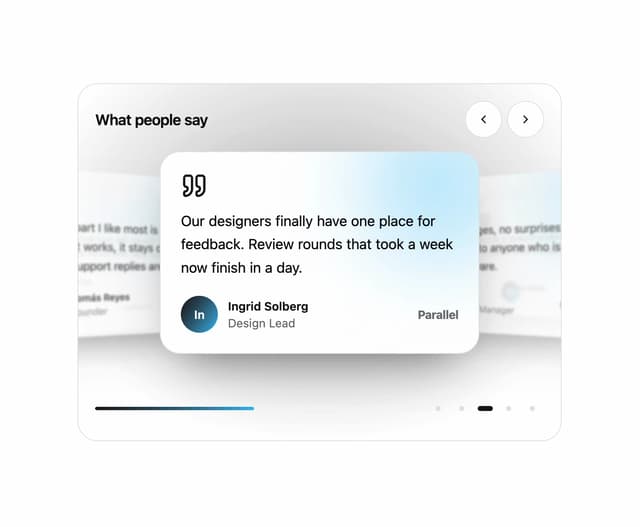
Testimonial Coverflow
16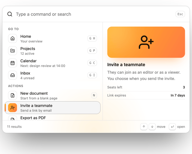
Command Palette
9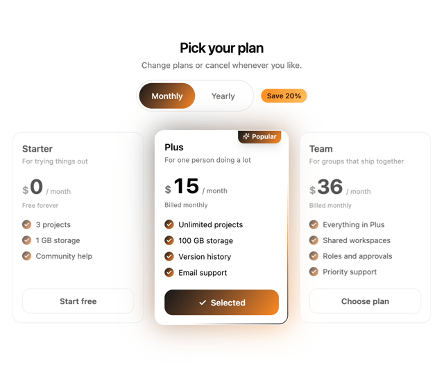
Pricing Plan Tilt
8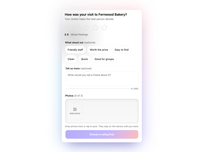
Photo Review Form
3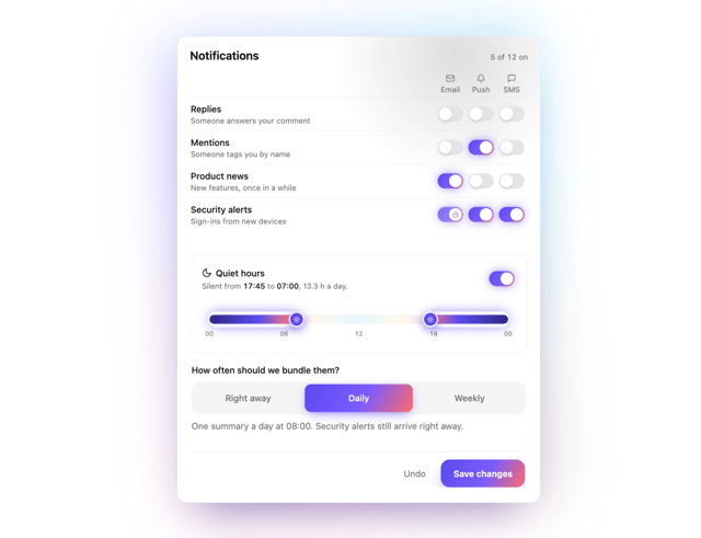
Notification Matrix
3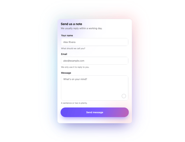
Live Contact Form
3
File Drop Physics
2