
About
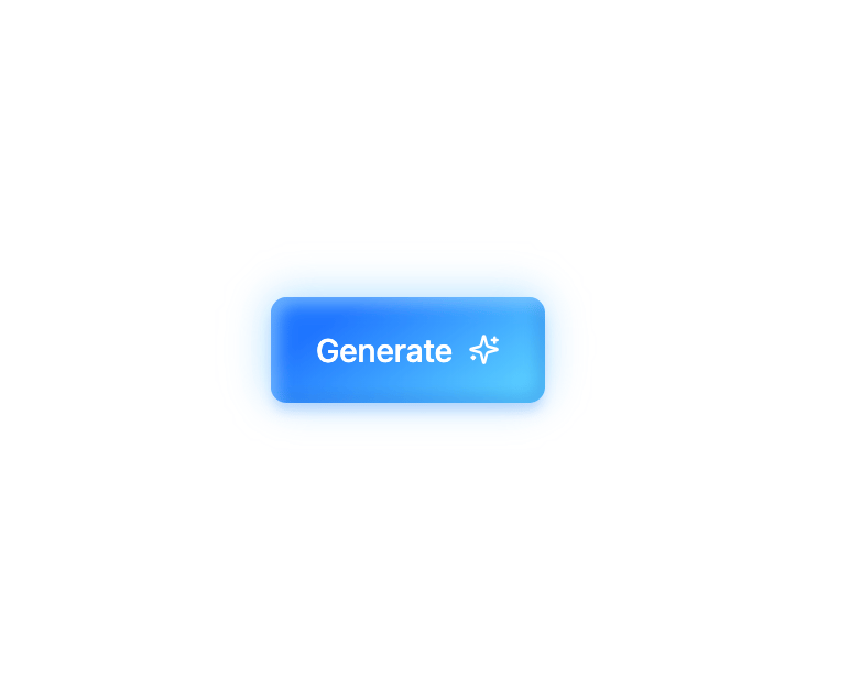
A clean glowing button that pops off the screen. On hover, a subtle glare slides across the surface, giving it that shiny, futuristic vibe. It also reacts with a soft press animation when clicked, making it feel alive. Works in both light and dark mode without extra setup. Perfect for flashy CTAs like Generate, Start, or Launch.
Built with React and Tailwind. Copy the prompt and paste it into Claude Code, Cursor or Lovable: your agent adds Glow Button to your project and fits it to your theme.
Code
How Glow Button is used: the demo's code. The component's own source comes with a free account.
Usage.tsx
import { Component } from "@/components/ui/glow-button";

export default function Default() {
  return (
    <div className="flex h-screen w-screen items-center justify-center bg-background text-foreground">
      <Component />
    </div>
  );
}
Dependencies
More by waiz
View all

SaaS Template
2.7K
image auto slider
1.9K
Silk-Background-animation
959
Portfolio Hero
951
Gradient bars Background
631
Spotlight Button
403
Gradient Bar hero section
351
Retro Grid
273
More in Buttons
View all
Texture Button
106

Notification Button
115

Button
1
Button
12
Base Button
1

HeroUI Button Group


App Store Button
483

Button
35

