
About
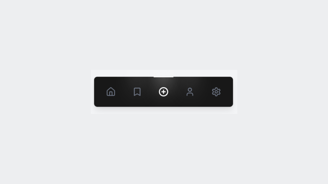
A modern and minimal bottom navigation bar with smooth spotlight effects on hover. Simple icons and subtle motion give it a polished feel that's perfect for clean UI designs.
Built with React and Tailwind. Copy the prompt and paste it into Claude Code, Cursor or Lovable: your agent adds Spotlight Button to your project and fits it to your theme.
Code
How Spotlight Button is used: the demo's code. The component's own source comes with a free account.
Usage.tsx
// This is file with demos of your component
// Each export is one usecase for your component

import { Component } from "@/components/ui/spotlight-button";

const DemoOne = () => {
  return <Component />;
};

export { DemoOne };
Dependencies
More by waiz
View all

SaaS Template
2.7K
image auto slider
1.9K
Silk-Background-animation
961
Portfolio Hero
954
Gradient bars Background
632
Glow Button
426
Gradient Bar hero section
352
Retro Grid
274
More in Buttons
View all
Texture Button
107
Button
14

Notification Button
117

HeroUI Button Group
1

Base Button
2
Button
2

Button
36

App Store Button
484

