
About
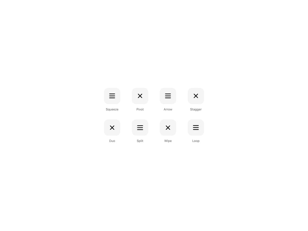
Eight animated hamburger menu icons that morph into a close X or back arrow in CSS. Set line thickness, speed and rounded ends, with a still swap for reduced motion.
Built with React and Tailwind. Copy the prompt and paste it into Claude Code, Cursor or Lovable: your agent adds Animated Hamburger Menu to your project and fits it to your theme.
Code
How Animated Hamburger Menu is used: the demo's code. The component's own source comes with a free account.
Usage.tsx
"use client";

import * as React from "react";
import { HamburgerMenu, type HamburgerMenuVariant } from "@/components/ui/animated-hamburger-menu";

const settings = {
  thickness: 2,
  duration: 420,
  rounded: true,
};

const VARIANTS: { id: HamburgerMenuVariant; label: string; open: boolean }[] = [
  { id: "squeeze", label: "Squeeze", open: false },
  { id: "pivot", label: "Pivot", open: true },
  { id: "arrow", label: "Arrow", open: false },
  { id: "stagger", label: "Stagger", open: true },
  { id: "duo", label: "Duo", open: true },
  { id: "split", label: "Split", open: false },
  { id: "wipe", label: "Wipe", open: true },
  { id: "loop", label: "Loop", open: false },
];

export default function Demo(props: Partial<typeof settings>) {
  const s = { ...settings, ...props };
  const [open, setOpen] = React.useState<Record<string, boolean>>(() =>
    Object.fromEntries(VARIANTS.map((v) => [v.id, v.open])),
  );

  return (
    <div className="flex min-h-[420px] w-full items-center justify-center bg-background px-4 py-12">
      <div className="grid grid-cols-2 gap-x-8 gap-y-8 text-foreground sm:grid-cols-4 sm:gap-x-12">
        {VARIANTS.map(({ id, label }) => (
          <div key={id} className="flex flex-col items-center gap-3">
            <HamburgerMenu
              variant={id}
              size={36}
              thickness={s.thickness}
              duration={s.duration}
              rounded={s.rounded}
              open={open[id]}
              onOpenChange={(next) => setOpen((o) => ({ ...o, [id]: next }))}
              aria-label={`${label} menu`}
              className="rounded-[18px] bg-muted"
              style={{ width: 68, height: 68 }}
            />
            <span className="text-[13px] text-muted-foreground">{label}</span>
          </div>
        ))}
      </div>
    </div>
  );
}
Dependencies
More by Wensity Labs
View all

Sidebar
364
Calendar
259
Button
117
Color Picker
93
Image Comparison Slider
79
AI Prompt Input
74
Text Morphing
54
Carousel
50
More in Navigation
View all

Pagination
38
Navbar
8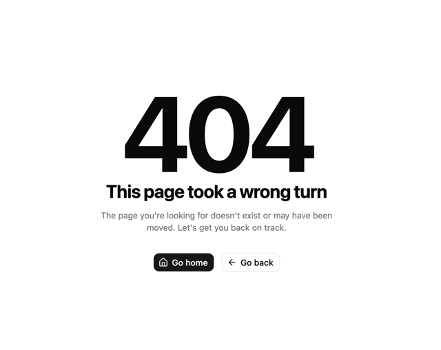

Oversized 404 Numeral
72
Footer
456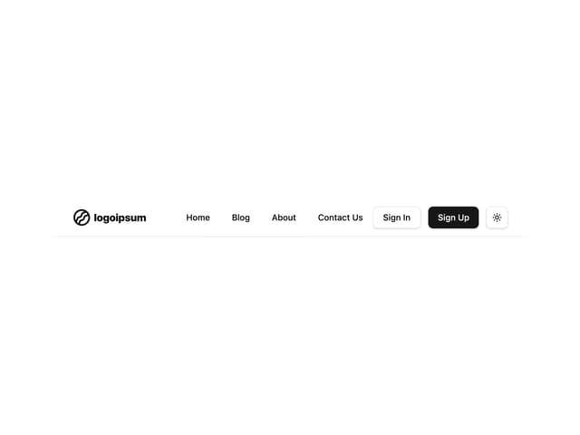
Navbar with Theme Toggle
59
Tabs like bookmark
76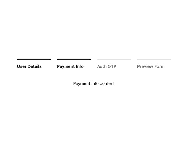

Progress Bar Stepper
57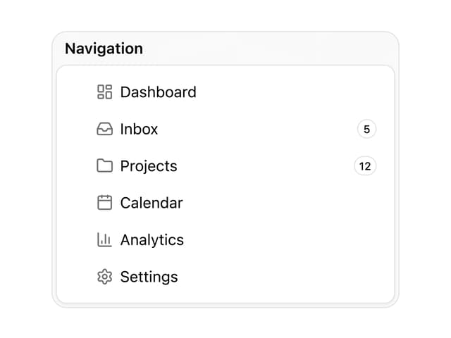
Sortable Sidebar Navigation
75


