"use client";

import * as React from "react";
import { HoverCard, HoverCardTrigger, HoverCardContent, HoverCardTitle, HoverCardDescription } from "@/components/ui/hover-card";

import { clsx, type ClassValue } from "clsx";
import { twMerge } from "tailwind-merge";

function cn(...inputs: ClassValue[]) {
  return twMerge(clsx(inputs));
}

const primitivePreviewCardSurfaceFrameClass = cn(
  "relative isolate overflow-hidden rounded-2xl",
  "border",
);

const primitivePreviewCardSurfaceLightClass = cn(
  "border-black/[0.08] bg-[#f4f4f5]",
  "[box-shadow:0_1px_2px_rgba(0,0,0,.06),0_8px_24px_-12px_rgba(0,0,0,.08)]",
);

const primitivePreviewCardSurfaceClass = cn(
  primitivePreviewCardSurfaceFrameClass,
  primitivePreviewCardSurfaceLightClass,
  // Full static `dark:bg-[#0a0a0b]` kept for Tailwind content scan - same as
  // PRIMITIVE_PREVIEW_CANVAS_DARK_BG / PRIMITIVE_PREVIEW_CANVAS_DARK.
  "dark:border-white/[0.06] dark:bg-[#0a0a0b] dark:[box-shadow:0_1px_2px_rgba(0,0,0,.4),0_8px_24px_-12px_rgba(0,0,0,.6)]",
);

const wensityCardSurfaceClass = primitivePreviewCardSurfaceClass;

const inlineHoverTriggerClass = cn(
  "inline cursor-help appearance-none bg-transparent p-0 align-baseline",
  "text-[inherit] font-semibold leading-[inherit] text-[var(--foreground)] underline decoration-[var(--border)] decoration-1 underline-offset-[4px]",
  "transition-colors hover:decoration-[color:var(--border-strong,color-mix(in_srgb,var(--foreground)_16%,transparent))] focus-visible:outline-none focus-visible:ring-2 focus-visible:ring-[color:var(--primitive-ring,color-mix(in_srgb,var(--foreground)_45%,transparent))]",
);

function InlineHoverTerm({
  children,
  title,
  description,
  meta,
  defaultOpen,
}: {
  defaultOpen?: boolean;
  children: React.ReactNode;
  title: string;
  description: string;
  meta?: string[];
}) {
  return (
    <HoverCard openDelay={220} closeDelay={140} defaultOpen={defaultOpen}>
      <HoverCardTrigger asChild>
        <button type="button" className={inlineHoverTriggerClass}>
          {children}
        </button>
      </HoverCardTrigger>
      <HoverCardContent width="md" className="text-left">
        <HoverCardTitle>{title}</HoverCardTitle>
        <HoverCardDescription className="mt-1.5">
          {description}
        </HoverCardDescription>
        {meta?.length ? (
          <div className="mt-3 flex flex-wrap items-center gap-x-3 gap-y-1 text-[10px] font-medium uppercase tracking-[0.08em] text-[var(--muted-foreground)]">
            {meta.map((item, index) => (
              <React.Fragment key={item}>
                {index > 0 ? (
                  <span className="size-1 rounded-full bg-[var(--border)]" aria-hidden="true" />
                ) : null}
                <span>{item}</span>
              </React.Fragment>
            ))}
          </div>
        ) : null}
      </HoverCardContent>
    </HoverCard>
  );
}

function ParagraphPreviewFrame({ children }: { children: React.ReactNode }) {
  return (
    <div className={cn(wensityCardSurfaceClass, "w-full max-w-xl p-6 sm:p-7")}>
      <div className="space-y-4 text-[13px] leading-7 text-[var(--muted-foreground)]">
        {children}
      </div>
    </div>
  );
}

export function HoverCardPreview() {
  return (
    <div className="flex min-h-[420px] w-full items-start justify-center px-6 pt-10 pb-40">
      <ParagraphPreviewFrame>
      <p>
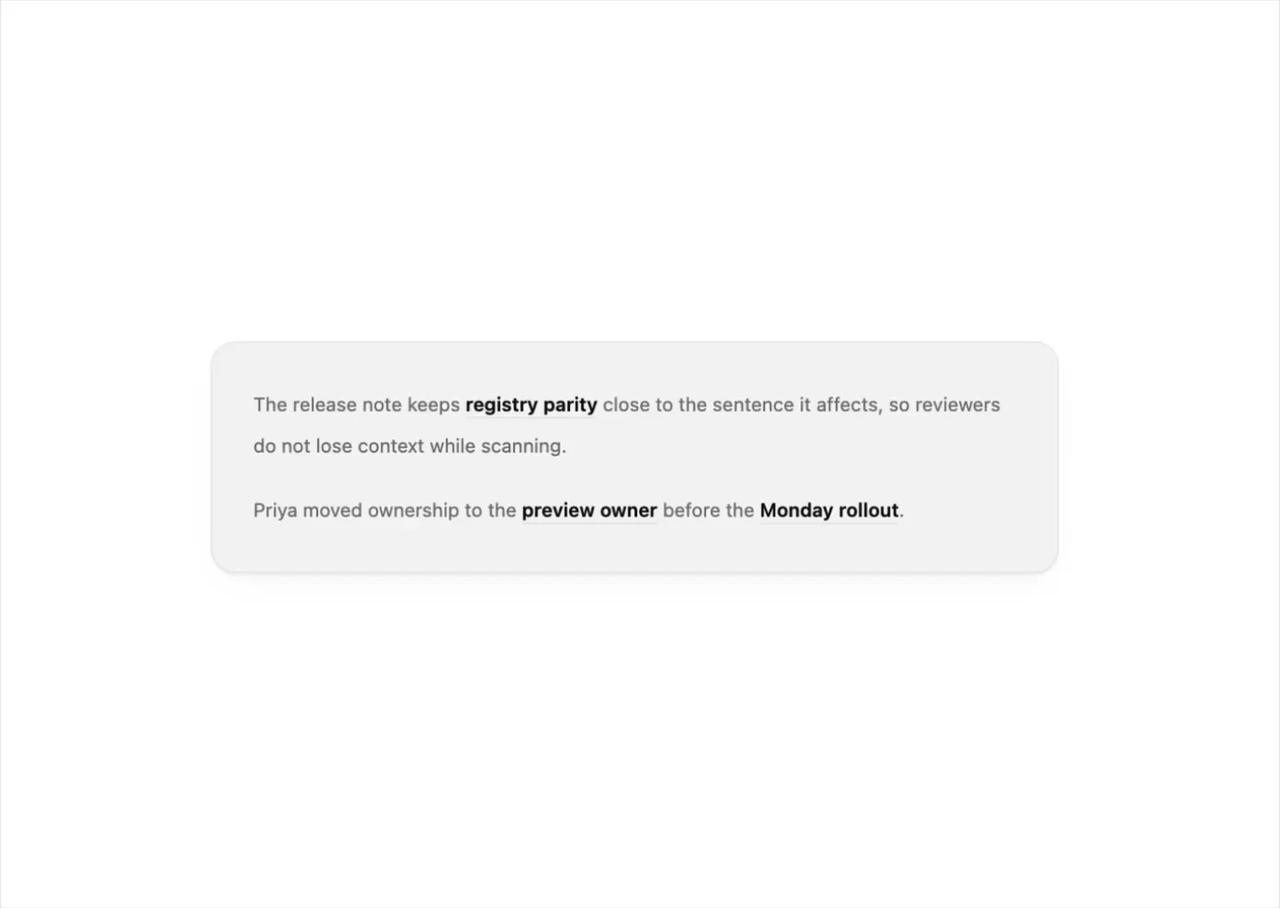
        The release note keeps{" "}
        <InlineHoverTerm
          defaultOpen
          title="Registry parity"
          description="Every install surface resolves the same source artifact before the component is marked ready."
          meta={["source", "release gate"]}
        >
          registry parity
        </InlineHoverTerm>{" "}
        close to the sentence it affects, so reviewers do not lose context while scanning.
      </p>
      <p>
        Priya moved ownership to the{" "}
        <InlineHoverTerm
          title="Preview owner"
          description="Responsible for keeping the live demo, usage snippet, and generated metadata aligned."
          meta={["docs", "demo"]}
        >
          preview owner
        </InlineHoverTerm>{" "}
        before the{" "}
        <InlineHoverTerm
          title="Monday rollout"
          description="A narrow launch window for publishing the source object and refreshing the public registry mirror."
          meta={["publish", "mirror"]}
        >
          Monday rollout
        </InlineHoverTerm>
        .
      </p>
      </ParagraphPreviewFrame>
    </div>
  );
}

export default function Demo() {
  return <HoverCardPreview />;
}