"use client";

import * as React from "react";
import { IconInfoCircle } from "@tabler/icons-react";
import { Popover, PopoverContent, PopoverDescription, PopoverTitle, PopoverTrigger } from "@/components/ui/popover";

import { clsx, type ClassValue } from "clsx";
import { twMerge } from "tailwind-merge";

function cn(...inputs: ClassValue[]) {
  return twMerge(clsx(inputs));
}

const Button = React.forwardRef<
  HTMLButtonElement,
  React.ButtonHTMLAttributes<HTMLButtonElement> & {
    variant?: "primary" | "secondary" | "ghost";
    leftIcon?: React.ReactNode;
  }
>(function Button({ variant = "primary", leftIcon, className, children, ...props }, ref) {
  return (
    <button
      ref={ref}
      type="button"
      className={cn(
        "inline-flex h-9 items-center justify-center gap-2 rounded-[10px] px-4 text-sm font-medium outline-none transition-colors focus-visible:ring-2 focus-visible:ring-[var(--ring)] [&_svg]:size-4",
        variant === "primary" && "bg-[var(--primary)] text-[var(--primary-foreground)] hover:opacity-90",
        variant === "secondary" && "border border-[var(--border)] bg-[var(--background)] text-[var(--foreground)] hover:bg-[var(--muted)]",
        variant === "ghost" && "text-[var(--foreground)] hover:bg-[var(--muted)]",
        className,
      )}
      {...props}
    >
      {leftIcon}
      {children}
    </button>
  );
});

const primitivePreviewCardSurfaceFrameClass = cn(
  "relative isolate overflow-hidden rounded-2xl",
  "border",
);

const primitivePreviewCardSurfaceLightClass = cn(
  "border-black/[0.08] bg-[#f4f4f5]",
  "[box-shadow:0_1px_2px_rgba(0,0,0,.06),0_8px_24px_-12px_rgba(0,0,0,.08)]",
);

const primitivePreviewCardSurfaceClass = cn(
  primitivePreviewCardSurfaceFrameClass,
  primitivePreviewCardSurfaceLightClass,
  // Full static `dark:bg-[#0a0a0b]` kept for Tailwind content scan - same as
  // PRIMITIVE_PREVIEW_CANVAS_DARK_BG / PRIMITIVE_PREVIEW_CANVAS_DARK.
  "dark:border-white/[0.06] dark:bg-[#0a0a0b] dark:[box-shadow:0_1px_2px_rgba(0,0,0,.4),0_8px_24px_-12px_rgba(0,0,0,.6)]",
);

const wensityCardSurfaceClass = primitivePreviewCardSurfaceClass;

function DemoFrame({
  title,
  subtitle,
  children,
}: {
  title: string;
  subtitle?: string;
  children: React.ReactNode;
}) {
  return (
    <div className={cn(wensityCardSurfaceClass, "flex w-full max-w-md flex-col items-center p-5")}>
      <div className="mb-4 w-full border-b border-[var(--border)] pb-3 text-center">
        <p className="text-sm font-semibold tracking-[-0.015em] text-[var(--foreground)]">
          {title}
        </p>
        {subtitle ? (
          <p className="mt-1 text-[12px] text-[var(--muted-foreground)]">{subtitle}</p>
        ) : null}
      </div>
      {children}
    </div>
  );
}

export function PopoverPreview() {
  return (
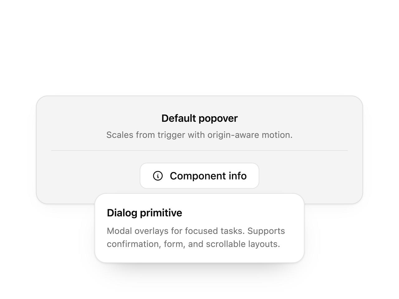
    <DemoFrame title="Default popover" subtitle="Scales from trigger with origin-aware motion.">
      <Popover defaultOpen>
        <PopoverTrigger asChild>
          <Button variant="secondary" leftIcon={<IconInfoCircle stroke={1.75} />}>
            Component info
          </Button>
        </PopoverTrigger>
        <PopoverContent width="md">
          <PopoverTitle>Dialog primitive</PopoverTitle>
          <PopoverDescription className="mt-1.5">
            Modal overlays for focused tasks. Supports confirmation, form, and scrollable layouts.
          </PopoverDescription>
        </PopoverContent>
      </Popover>
    </DemoFrame>
  );
}

export default function Demo() {
  return <PopoverPreview />;
}