

About
A React star rating input with half stars, drag to rate, optional word labels and five tones, in cut or classic star styles. A read only mode shows review scores.
Built with React and Tailwind. Copy the prompt and paste it into Claude Code, Cursor or Lovable: your agent adds Star Rating to your project and fits it to your theme.
Code
How Star Rating is used: the demo's code. The component's own source comes with a free account.
Usage.tsx
"use client";

import * as React from "react";
import { StarRating, type StarRatingTone, type StarRatingVariant } from "@/components/ui/star-rating";

const settings = {
  variant: "cut",
  tone: "gold",
  size: 60,
  half: true,
  readOnly: false,
};

const LABELS = ["Not for me", "Could be better", "It's fine", "Really good", "Love it"];

export default function Demo(props: Partial<typeof settings>) {
  const s = { ...settings, ...props };
  const [value, setValue] = React.useState(4.5);

  return (
    <div className="flex min-h-[420px] w-full items-center justify-center bg-background px-4 py-12">
      <StarRating
        value={s.readOnly ? 4.7 : value}
        onValueChange={setValue}
        variant={s.variant as StarRatingVariant}
        precision={s.half ? 0.5 : 1}
        size={s.size}
        tone={s.tone as StarRatingTone}
        readOnly={s.readOnly}
        labels={LABELS}
        aria-label="Rate this component"
        className="max-w-full"
      />
    </div>
  );
}
Dependencies
More by Wensity Labs
View all

Sidebar
364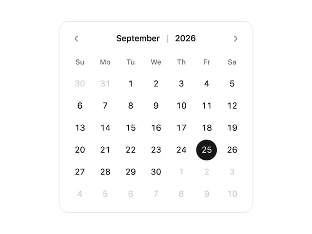
Calendar
259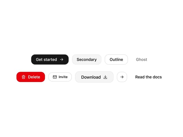
Button
117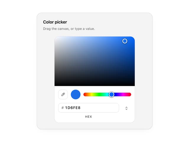
Color Picker
93
Image Comparison Slider
79
AI Prompt Input
74
Text Morphing
54
Carousel
50