"use client";

import * as React from "react";
import { IconAlignCenter, IconAlignLeft, IconAlignRight, IconBold, IconItalic, IconUnderline } from "@tabler/icons-react";
import { Toggle, ToggleGroup, ToggleGroupItem } from "@/components/ui/toggle";

import { clsx, type ClassValue } from "clsx";
import { twMerge } from "tailwind-merge";

function cn(...inputs: ClassValue[]) {
  return twMerge(clsx(inputs));
}

const primitivePreviewCardSurfaceFrameClass = cn(
  "relative isolate overflow-hidden rounded-2xl",
  "border",
);

const primitivePreviewCardSurfaceLightClass = cn(
  "border-black/[0.08] bg-[#f4f4f5]",
  "[box-shadow:0_1px_2px_rgba(0,0,0,.06),0_8px_24px_-12px_rgba(0,0,0,.08)]",
);

const primitivePreviewCardSurfaceClass = cn(
  primitivePreviewCardSurfaceFrameClass,
  primitivePreviewCardSurfaceLightClass,
  // Full static `dark:bg-[#0a0a0b]` kept for Tailwind content scan - same as
  // PRIMITIVE_PREVIEW_CANVAS_DARK_BG / PRIMITIVE_PREVIEW_CANVAS_DARK.
  "dark:border-white/[0.06] dark:bg-[#0a0a0b] dark:[box-shadow:0_1px_2px_rgba(0,0,0,.4),0_8px_24px_-12px_rgba(0,0,0,.6)]",
);

const wensityCardSurfaceClass = primitivePreviewCardSurfaceClass;

function PreviewRow({ children }: { children: React.ReactNode }) {
  return (
    <div className="flex flex-wrap items-center justify-center gap-3">
      {children}
    </div>
  );
}

function PreviewPanel({
  children,
  className,
  title,
  subtitle,
}: {
  children: React.ReactNode;
  className?: string;
  title?: string;
  subtitle?: string;
}) {
  return (
    <div
      className={cn(
        wensityCardSurfaceClass,
        "w-full max-w-md p-5 sm:p-6",
        className,
      )}
    >
      {title ? (
        <div className="mb-5 border-b border-[var(--border)] pb-4">
          <p className="text-sm font-semibold tracking-[-0.015em] text-[var(--foreground)]">
            {title}
          </p>
          {subtitle ? (
            <p className="mt-1 text-[12px] leading-[1.5] text-[var(--muted-foreground)]">
              {subtitle}
            </p>
          ) : null}
        </div>
      ) : null}
      {children}
    </div>
  );
}

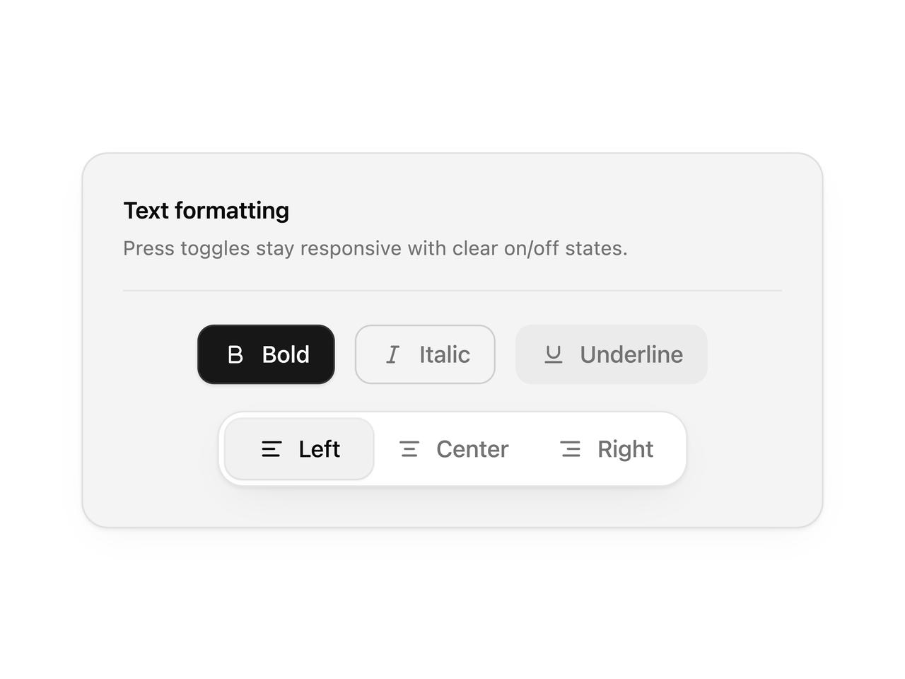
export function TogglePreview() {
  const [bold, setBold] = React.useState(true);
  const [align, setAlign] = React.useState("left");

  return (
    <PreviewPanel
      title="Text formatting"
      subtitle="Press toggles stay responsive with clear on/off states."
    >
      <div className="space-y-4">
        <PreviewRow>
          <Toggle pressed={bold} onPressedChange={setBold} aria-label="Bold">
            <IconBold stroke={2} />
            Bold
          </Toggle>
          <Toggle variant="outline" aria-label="Italic">
            <IconItalic stroke={2} />
            Italic
          </Toggle>
          <Toggle variant="soft" aria-label="Underline">
            <IconUnderline stroke={2} />
            Underline
          </Toggle>
        </PreviewRow>

        <PreviewRow>
          <ToggleGroup
            type="single"
            value={align}
            onValueChange={(next) => typeof next === "string" && setAlign(next)}
            variant="outline"
            aria-label="Text alignment"
          >
            <ToggleGroupItem value="left" aria-label="Align left">
              <IconAlignLeft stroke={2} />
              Left
            </ToggleGroupItem>
            <ToggleGroupItem value="center" aria-label="Align center">
              <IconAlignCenter stroke={2} />
              Center
            </ToggleGroupItem>
            <ToggleGroupItem value="right" aria-label="Align right">
              <IconAlignRight stroke={2} />
              Right
            </ToggleGroupItem>
          </ToggleGroup>
        </PreviewRow>
      </div>
    </PreviewPanel>
  );
}

export default function Demo() {
  return <TogglePreview />;
}