
About
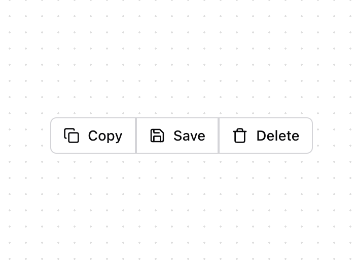
A versatile button group component for organizing related actions with consistent spacing and visual connection.
Built with React and Tailwind. Copy the prompt and paste it into Claude Code, Cursor or Lovable: your agent adds Button Group with Icons to your project and fits it to your theme.
Code
How Button Group with Icons is used: the demo's code. The component's own source comes with a free account.
Usage.tsx
import { ButtonGroupDemo } from "@/components/ui/button-group-with-icons";

function ButtonGroup() {
  return (
    <div className="block">
      <ButtonGroupDemo />
    </div>
  );
}

export { ButtonGroup };
Dependencies
More by Prism UI
View all
Display Cards
5.6K
Pricing
4K
Expandable Card
340
Floating Action Panel
203
Hero Badge
162
useExpandable
139
Logo Carousel
133
Icons
133
More in Buttons
View all
Button
10

Button
4

Button Group
38
Native Button
12
Texture Button
102

HeroUI Button Group
11
Split Button
36
Button
76


