
About
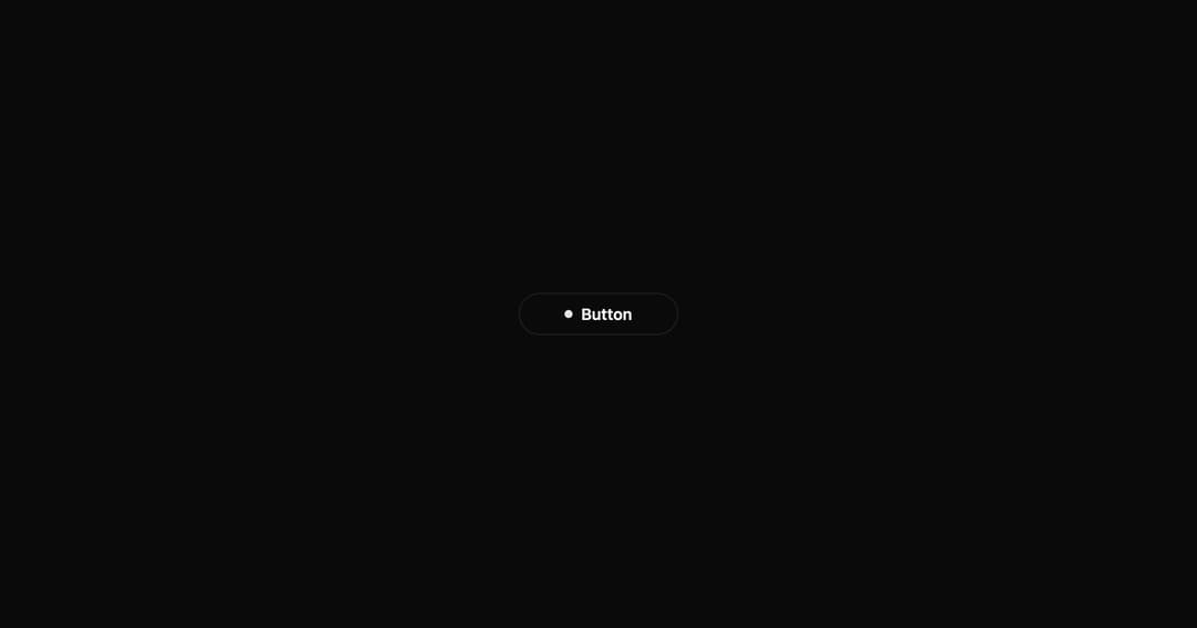
A button with expanding dot animation, loading state with spinner, and success checkmark. Multi-state interactive component.
Built with React and Tailwind. Copy the prompt and paste it into Claude Code, Cursor or Lovable: your agent adds Interactive Hover Button to your project and fits it to your theme.
Code
How Interactive Hover Button is used: the demo's code. The component's own source comes with a free account.
Usage.tsx
import InteractiveHoverButton from "../components/ui/interactive-hover-button";

export default function Demo() {
  return (
    <div className="flex items-center justify-center min-h-screen bg-background">
      <InteractiveHoverButton text="Button" />
    </div>
  );
}
Dependencies
More by Shatlyk1011
View all
Motion Button
895
3D Marquee
730
Hover Border Gradient
631
Team Member Card
578
Link Hover
295
Typing Effect
270
Animated Dropdown
234
Gradient Borders Button
230
More in Buttons
View all

Button
1
Button
6

App Store Button
471

Button
34
Native Button
2

Button
53
Figma File Button
33
Button
74


