
About
A monochrome pill-shaped tab bar where the active tab morphs into a labeled pill while inactive tabs collapse into icon-only circles, useful for a mail client, dashboard, or settings switcher.
Built with React and Tailwind. Copy the prompt and paste it into Claude Code, Cursor or Lovable: your agent adds Expanding Tabs to your project and fits it to your theme.
Code
How Expanding Tabs is used: the demo's code. The component's own source comes with a free account.
Usage.tsx
import ExpandingTabs from "@/components/ui/expanding-tabs";

export default function ExpandingTabsDemo() {
  return <ExpandingTabs />;
}
Dependencies
More by aicanvas
View all

Stack Tower
100
Runway Loader
97
Blind Pull Toggle
80
Magnetic Logo Cluster
15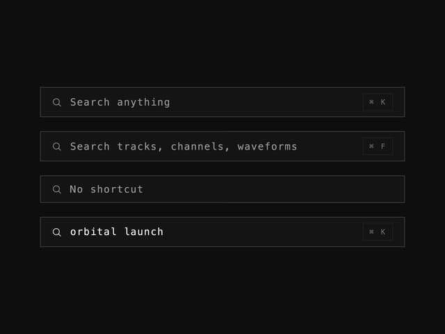
Search Field

Glass Search Bar
More in Navigation
View all

Sidebar
328
Oversized 404 Numeral
65

Footer 2
217
Navbar with Theme Toggle
52
Stacked Circular Footer
439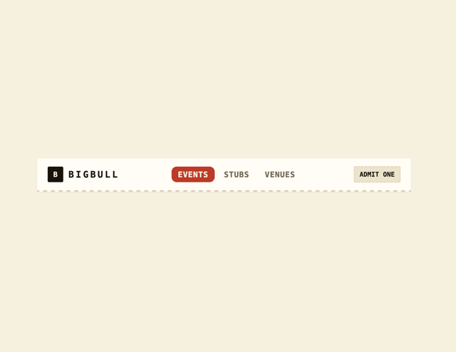
Navbar
4

Tabs
33
Pagination with Icon and Label
20


