
About
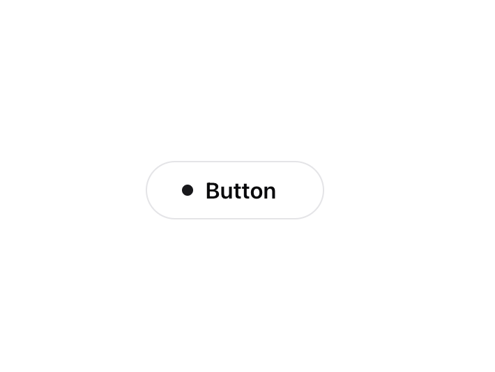
A visually engaging button component that responds to hover with dynamic transitions, adapting smoothly between light and dark modes for enhanced user interactivity.
Built with React and Tailwind. Copy the prompt and paste it into Claude Code, Cursor or Lovable: your agent adds Interactive Hover Button to your project and fits it to your theme.
Code
How Interactive Hover Button is used: the demo's code. The component's own source comes with a free account.
Usage.tsx
import { InteractiveHoverButton } from "@/components/ui/interactive-hover-button";


function InteractiveHoverButtonDemo() {
  return (
    <div className="relative justify-center">
      <InteractiveHoverButton />
    </div>
  );
}

export { InteractiveHoverButtonDemo };
Dependencies
More by Dillion Verma
View all

Rainbow Button
2.5K
Globe
2.3K
Animated Beam
2.1K
Text Reveal
1.7K
Confetti
1.2K
Sparkles Text
1.2K
Interactive Icon Cloud
1.1K
Shine Border
1K
More in Buttons
View all
Texture Button
108
Button
14

Notification Button
117

HeroUI Button Group
2

Eclipse Button
44
Button Save
50

App Store Button
484

Base Button
1


