
About
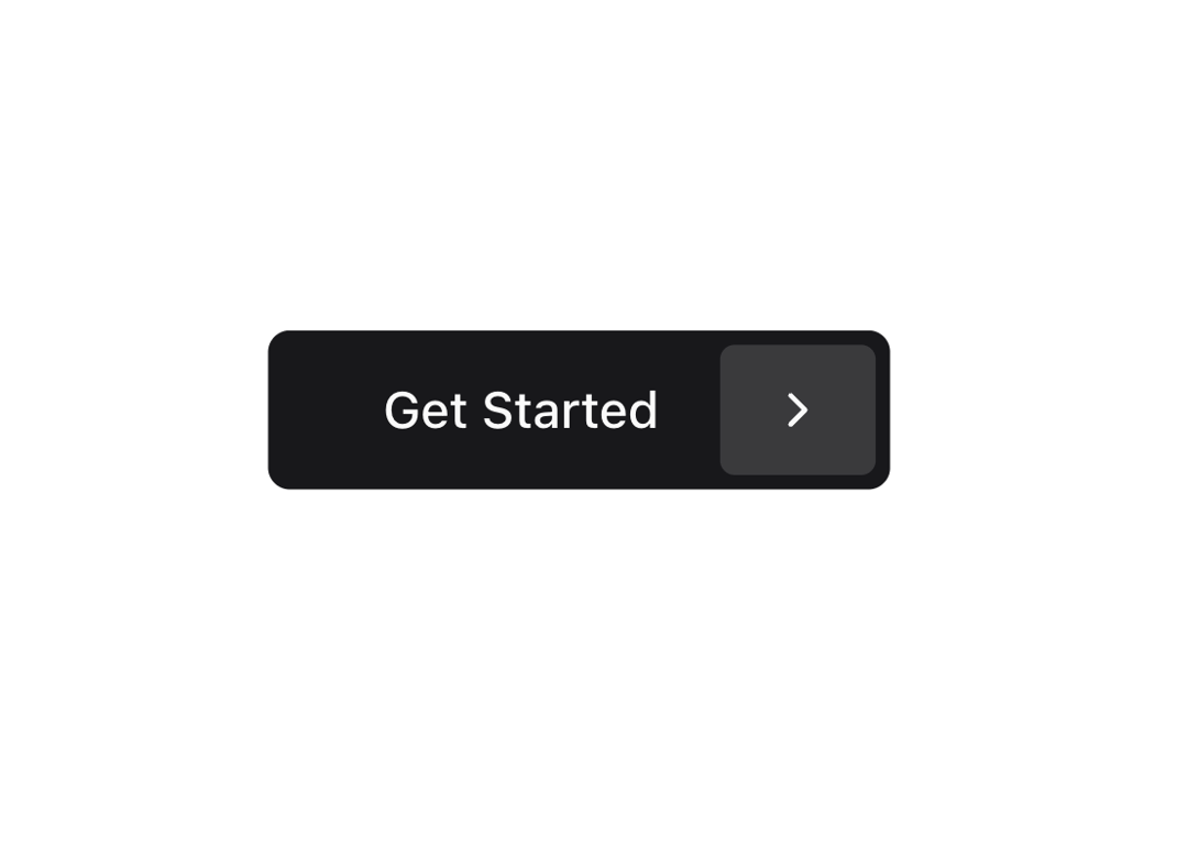
An animated call-to-action button that reveals a chevron icon on hover, perfect for primary actions and onboarding experiences.
Built with React and Tailwind. Copy the prompt and paste it into Claude Code, Cursor or Lovable: your agent adds Get Started Button to your project and fits it to your theme.
Code
How Get Started Button is used: the demo's code. The component's own source comes with a free account.
Usage.tsx
import { GetStartedButton } from "@/components/ui/get-started-button";

export function GetStartedButtonDemo() {
  return  <GetStartedButton />
}
Dependencies
More by Ozan
View all

Bookmark Icon Button
500
Back Button
325
Avatar Group with Tooltip
78
Brightness Control
42
Heart Button
37
More in Buttons
View all
Button
12

Notification Button
115
Texture Button
105

HeroUI Button Group
2

App Store Button
481
Button
78
Split Button
16

Button
5


