
About
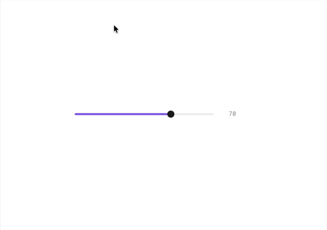
A labeled numeric slider with a live value readout, available as a native range input or as a draggable spring-animated track with a thumb that grows while held.
Built with React and Tailwind. Copy the prompt and paste it into Claude Code, Cursor or Lovable: your agent adds Slider to your project and fits it to your theme.
Code
How Slider is used: the demo's code. The component's own source comes with a free account.
Usage.tsx
"use client";

import Slider from "@/components/ui/slider";
import { useState } from "react";

// A native range input with the value shown on the right.
export default function SliderDemo() {
  const [confidence, setConfidence] = useState(70);
  return (
    <div style={{ width: 320 }}>
      <Slider value={confidence} onChange={setConfidence} />
    </div>
  );
}
More by halaska-studio
View all
Dot Grid
38
Orb
20
Segmented Control
15
Choicebox
8
Combobox
7
Input OTP
5
Switch
4
Dialog
4
More in Forms
View all

Premium Auth
543

Contact Card
1.1K

Form
17

Card Studio
46

Login 2
10

Book A Demo 1
80
Login Card
30

Login 1
58
