About
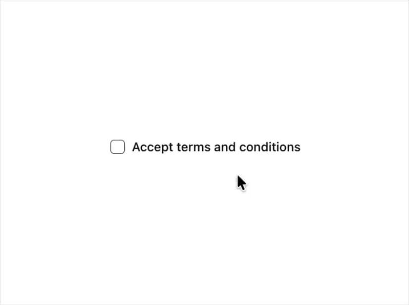
Renders an accessible label associated with controls.
Built with React and Tailwind. Copy the prompt and paste it into Claude Code, Cursor or Lovable: your agent adds Label to your project and fits it to your theme.
Code
How Label is used: the demo's code. The component's own source comes with a free account.
Usage.tsx
import { Checkbox } from "@/components/ui/checkbox"
import { Label } from "@/components/ui/label"

export function LabelDemo() {
  return (
    <div>
      <div className="flex items-center space-x-2">
        <Checkbox id="terms" />
        <Label htmlFor="terms">Accept terms and conditions</Label>
      </div>
    </div>
  )
}
Dependencies
More by shadcn
View all

Navigation menu
791
Calendar with time pressets
518
Sidebar
355
Sonner
238
Chart
222
Icons
199
Dropdown Menu
156
Calendar with event slots
124
More in Forms
View all

Premium Auth
543

Contact Card
1.1K

Form
17

Card Studio
46

Login 2
10

Book A Demo 1
80
Login Card
30

Login 1
58
