
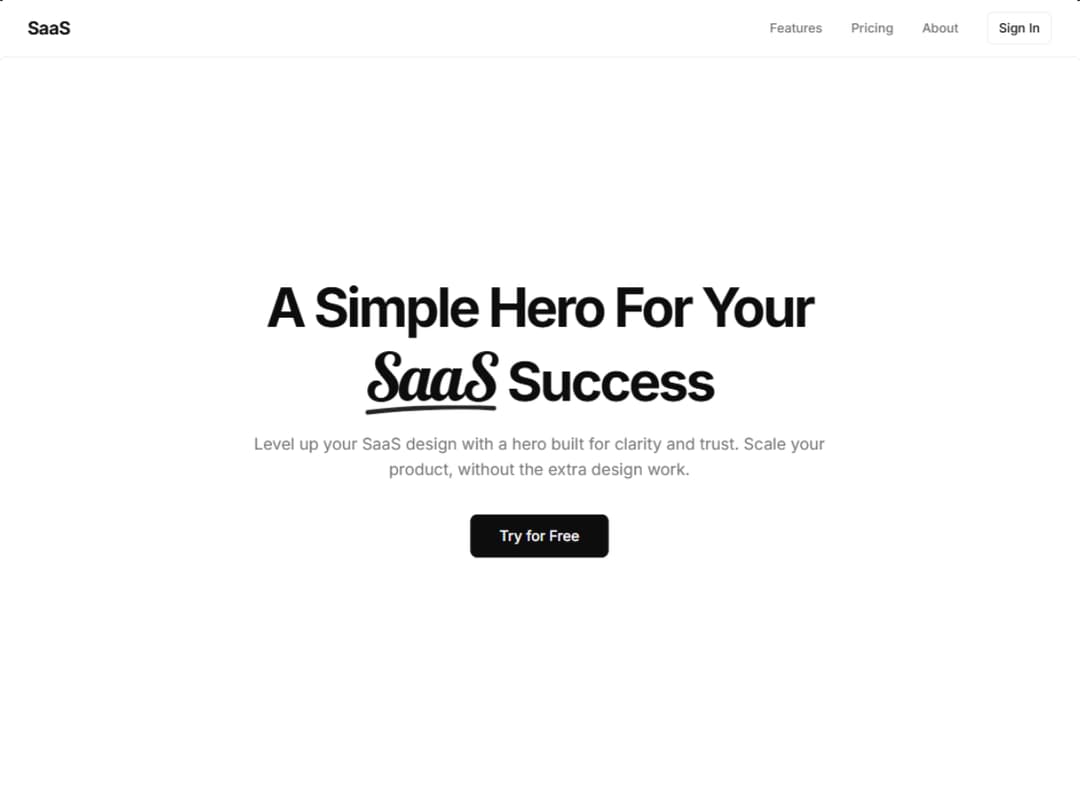
This sleek hero section showcases a modern SaaS landing page that immediately captures attention. The bold headline "A Simple Hero For Your SaaS Success" features elegant typography with the word "SaaS" styled in a decorative Lobster font and adorned with a hand-drawn underline The layout follows conversion-focused best practices with a clear value proposition that speaks directly to SaaS founders and product teams. The compelling copy emphasizes clarity, trust, and scalability—three critical factors for SaaS success. The white "Try for Free" call-to-action button stands out prominently against the dark background, utilizing strategic contrast to drive user engagement and conversions.
Built with React and Tailwind. Copy the prompt and paste it into Claude Code, Cursor or Lovable: your agent adds Underline Hero Section to your project and fits it to your theme.
Code
How Underline Hero Section is used: the demo's code. The component's own source comes with a free account.
Usage.tsx
import React, { useState } from "react";
 import Component from "@/components/ui/underline-hero-section";

export default function Demo() {
  const [message, setMessage] = useState<string>("");

  const onSignIn = () => {
    setMessage("Sign In clicked");
    setTimeout(() => setMessage(""), 3000);
  };

  const onTryForFree = () => {
    setMessage("Try for Free clicked");
    setTimeout(() => setMessage(""), 3000);
  };

  return (
    <>
      <link rel="stylesheet" href="https://fonts.googleapis.com/css2?family=Lobster&display=swap" />
      <style>{`
        .font-lobster {
          font-family: 'Lobster', cursive;
        }

        .demo-message {
          position: fixed;
          top: 80px;
          right: 20px;
          background: hsl(var(--primary));
          color: hsl(var(--primary-foreground));
          padding: 12px 20px;
          border-radius: 8px;
          box-shadow: 0 4px 12px hsl(var(--foreground) / 0.1);
          z-index: 100;
          animation: slideIn 0.3s ease-out;
        }

        @keyframes slideIn {
          from {
            transform: translateX(400px);
            opacity: 0;
          }
          to {
            transform: translateX(0);
            opacity: 1;
          }
        }
      `}</style>

      {message && (
        <div className="demo-message">
          {message}
        </div>
      )}

      <Component
        brand="SaaS"
        heroClassName="font-lobster"
        onSignIn={onSignIn}
        onTryForFree={onTryForFree}
      />
    </>
  );
}
Dependencies
More by waiz
View all

SaaS Template
2.5K
image auto slider
1.8K
Silk-Background-animation
943
Portfolio Hero
919
Gradient bars Background
601
Glow Button
400
Spotlight Button
386
Gradient Bar hero section
346
More in Heroes
View all

Responsive Hero Banner
2K

Hero
1.3K
Editorial Collage Hero
463
Centered Hero with Image Fan
982
Modern Landing Hero
124

Aero Hero-3
583

Hero Section 6
904

Hero Section with Responsive Navigation
41
