
About
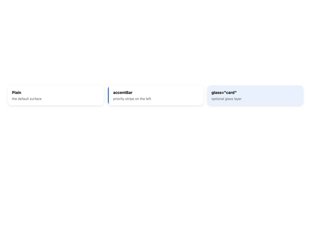
A themeable surface container for grouping related content, with an optional left priority accent bar and an opt-in glassmorphism layer.
Built with React and Tailwind. Copy the prompt and paste it into Claude Code, Cursor or Lovable: your agent adds Card to your project and fits it to your theme.
Code
How Card is used: the demo's code. The component's own source comes with a free account.
Usage.tsx
import Card from "@/components/ui/card";

export default function CardDemo() {
  return (
    <div className="w-full min-h-[320px] flex flex-wrap items-start gap-4 p-8 bg-background">
      <div className="flex-1 min-w-[220px]">
        <Card style={{ marginBottom: 0 }}>
          <b className="text-foreground">Plain</b>
          <div className="text-muted-foreground text-sm mt-1">
            the default surface
          </div>
        </Card>
      </div>
      <div className="flex-1 min-w-[220px]">
        <Card accentBar="#2F6FE0" style={{ marginBottom: 0 }}>
          <b className="text-foreground">accentBar</b>
          <div className="text-muted-foreground text-sm mt-1">
            priority stripe on the left
          </div>
        </Card>
      </div>
      <div className="flex-1 min-w-[220px]">
        <Card glass="card" style={{ marginBottom: 0, background: "#EAF1FE" }}>
          <b className="text-foreground">glass="card"</b>
          <div className="text-muted-foreground text-sm mt-1">
            optional glass layer
          </div>
        </Card>
      </div>
    </div>
  );
}
More by alexander-rukin
View all
Combobox
Textarea
Carousel
Tooltip
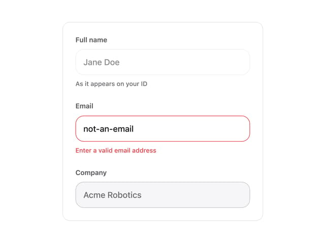
Input
Date Picker
More in Cards
View all
Stats cards with links
40

Course Design Cards
1.2K

Interactive Tech Stack Bento Grid with Hover Effects
445

Card Studio
36

Statistics Card 7
312
Statistics Card 2
293
The Item one
3

Testimonial
70
