
About
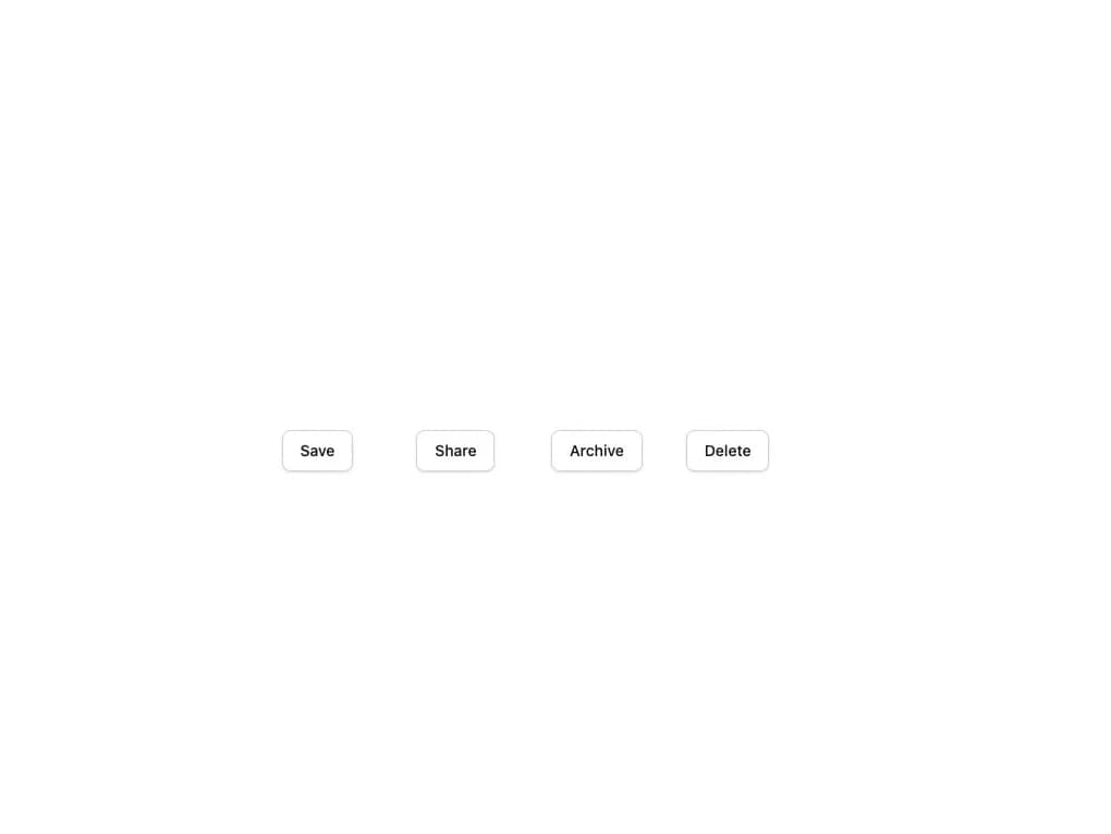
A small hover/focus hint bubble that appears next to a trigger element in one of four placements (top, bottom, left, right).
Built with React and Tailwind. Copy the prompt and paste it into Claude Code, Cursor or Lovable: your agent adds Tooltip to your project and fits it to your theme.
Code
How Tooltip is used: the demo's code. The component's own source comes with a free account.
Usage.tsx
import { Tooltip } from "@/components/ui/tooltip";
import { ThemeProvider } from "@/components/ui/tooltip-utils/theme";

export default function TooltipDemo() {
  return (
    <ThemeProvider dark={false}>
      <div className="flex min-h-[320px] w-full items-center justify-center bg-white p-10">
        <div className="grid grid-cols-2 gap-10 sm:grid-cols-4">
          <Tooltip content="Saves your changes" placement="top">
            <button className="rounded-md border border-neutral-300 bg-white px-4 py-2 text-sm font-medium text-neutral-900 shadow-sm">
              Save
            </button>
          </Tooltip>
          <Tooltip content="Shares this document" placement="bottom">
            <button className="rounded-md border border-neutral-300 bg-white px-4 py-2 text-sm font-medium text-neutral-900 shadow-sm">
              Share
            </button>
          </Tooltip>
          <Tooltip content="Opens the archive" placement="left">
            <button className="rounded-md border border-neutral-300 bg-white px-4 py-2 text-sm font-medium text-neutral-900 shadow-sm">
              Archive
            </button>
          </Tooltip>
          <Tooltip content="Deletes permanently" placement="right">
            <button className="rounded-md border border-neutral-300 bg-white px-4 py-2 text-sm font-medium text-neutral-900 shadow-sm">
              Delete
            </button>
          </Tooltip>
        </div>
      </div>
    </ThemeProvider>
  );
}
More by alexander-rukin
View all
Combobox
Textarea
Carousel
Card
Input
Date Picker
More in Buttons
View all
Texture Button
101

App Store Button
471

Button
14
Button
8

Button Group

Button
75
Native Button
7

Button
66


