
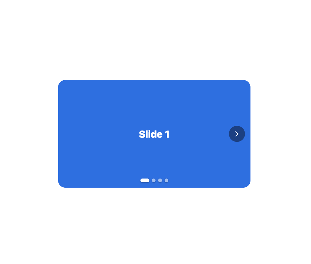
About
A swipeable, theme-aware image/slide carousel with prev/next arrows, dot indicators and keyboard arrow-key navigation.
Built with React and Tailwind. Copy the prompt and paste it into Claude Code, Cursor or Lovable: your agent adds Carousel to your project and fits it to your theme.
Code
How Carousel is used: the demo's code. The component's own source comes with a free account.
Usage.tsx
"use client";

import { Carousel } from "@/components/ui/carousel";

const CAROUSEL_SLIDES = [
  { bg: "#2F6FE0", label: "Slide 1" },
  { bg: "#7A5FC0", label: "Slide 2" },
  { bg: "#2FA855", label: "Slide 3" },
  { bg: "#FF9F0A", label: "Slide 4" },
];

export default function CarouselDemo() {
  return (
    <div
      style={{
        width: "100%",
        maxWidth: 460,
        padding: 16,
        boxSizing: "border-box",
      }}
    >
      <Carousel
        height={240}
        slides={CAROUSEL_SLIDES.map((s) => (
          <div
            key={s.label}
            style={{
              width: "100%",
              height: "100%",
              display: "flex",
              alignItems: "center",
              justifyContent: "center",
              background: s.bg,
              color: "#fff",
              fontSize: 22,
              fontWeight: 800,
            }}
          >
            {s.label}
          </div>
        ))}
      />
    </div>
  );
}
More by alexander-rukin
View all
Combobox
Textarea
Tooltip
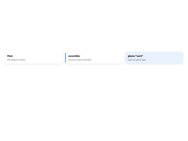
Card

Input
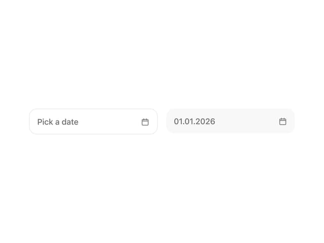
Date Picker
More in Galleries
View all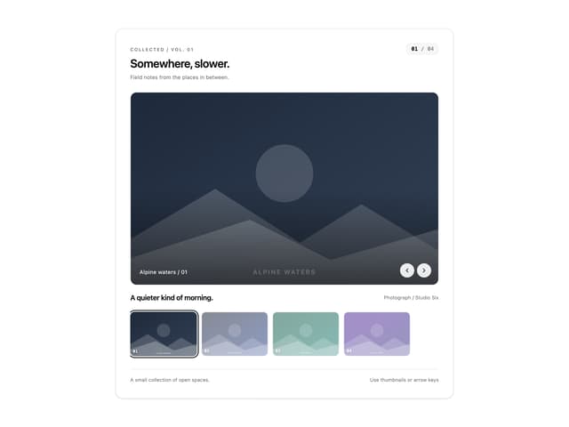
Thumbnail image viewer
83

Animated Gallery
1.5K

Image Gallery
1.4K

Elastic Gallery
1K
Editorial Collage Hero
478
3D Parallax Unfurling Gallery
1.1K

Shared Element Gallery
473
Img Sphere
2.1K


