
About
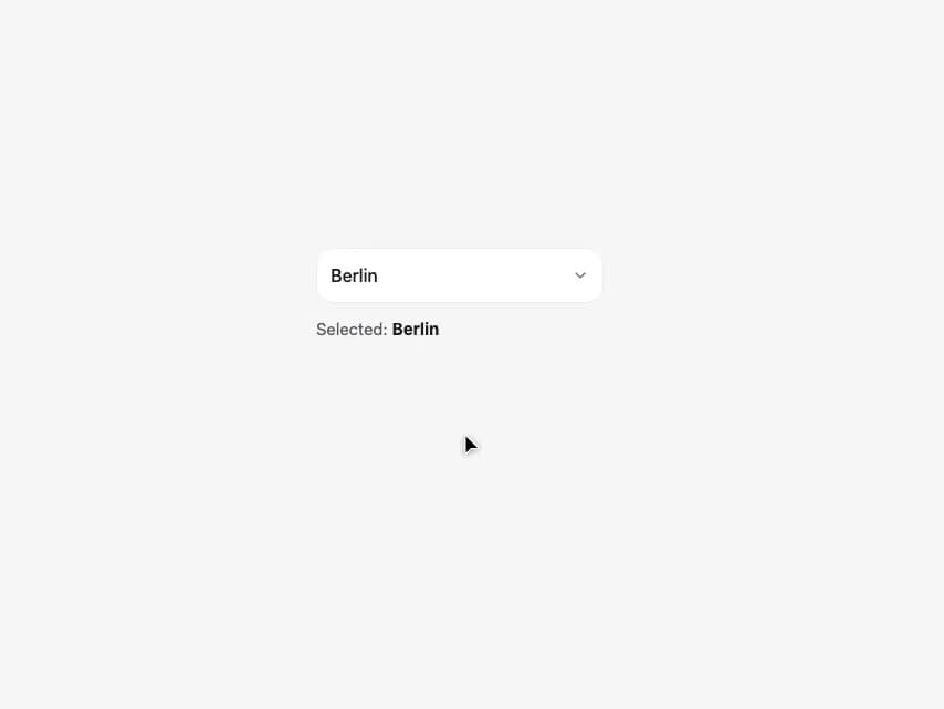
A text input with a filterable, keyboard-navigable dropdown of options, for picking one value out of a long list by typing instead of scrolling.
Built with React and Tailwind. Copy the prompt and paste it into Claude Code, Cursor or Lovable: your agent adds Combobox to your project and fits it to your theme.
Code
How Combobox is used: the demo's code. The component's own source comes with a free account.
Usage.tsx
import { Combobox } from "@/components/ui/combobox";
import { useState } from "react";

const COMBO_CITIES = [
  { value: "berlin", label: "Berlin" },
  { value: "munich", label: "Munich" },
  { value: "hamburg", label: "Hamburg" },
  { value: "cologne", label: "Cologne" },
  { value: "frankfurt", label: "Frankfurt" },
  { value: "stuttgart", label: "Stuttgart" },
  { value: "dresden", label: "Dresden" },
  { value: "leipzig", label: "Leipzig" },
];

export default function ComboboxDemo() {
  const [city, setCity] = useState("berlin");
  const selected = COMBO_CITIES.find((c) => c.value === city)?.label ?? "-";

  return (
    <div
      style={{
        width: "100%",
        minHeight: 420,
        display: "flex",
        alignItems: "flex-start",
        justifyContent: "center",
        padding: 40,
        background: "#F6F6F8",
        boxSizing: "border-box",
        fontFamily:
          "-apple-system, BlinkMacSystemFont, 'SF Pro Text', 'Segoe UI', Roboto, sans-serif",
      }}
    >
      <div style={{ width: 260 }}>
        <Combobox
          value={city}
          onChange={setCity}
          options={COMBO_CITIES}
          placeholder="City…"
        />
        <div style={{ marginTop: 12, fontSize: 15, color: "#5B5B61" }}>
          Selected: <b style={{ color: "#1C1C1E" }}>{selected}</b>
        </div>
      </div>
    </div>
  );
}
More by alexander-rukin
View all
Textarea
Carousel
Tooltip
Card
Input
Date Picker