
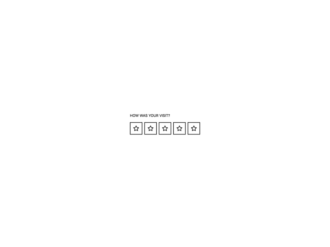
About
A star, heart, or smiley icon rating input rendered as an accessible radio group, with optional read-only, disabled, and clear-to-zero states.
Built with React and Tailwind. Copy the prompt and paste it into Claude Code, Cursor or Lovable: your agent adds Rating to your project and fits it to your theme.
Code
How Rating is used: the demo's code. The component's own source comes with a free account.
Usage.tsx
import Rating from "@/components/ui/rating";

import { useState } from "react";

export default function RatingDemo() {
  const [value, setValue] = useState(0);

  return (
    <div className="eink-theme flex min-h-[320px] w-full items-center justify-center p-10">
      <Rating value={value} onChange={setValue} max={5}>
        How was your visit?
      </Rating>
    </div>
  );
}
More by alexisroe
View all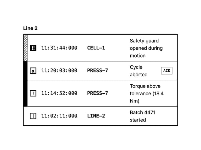
Log
7
Notification
2
Number Stepper
2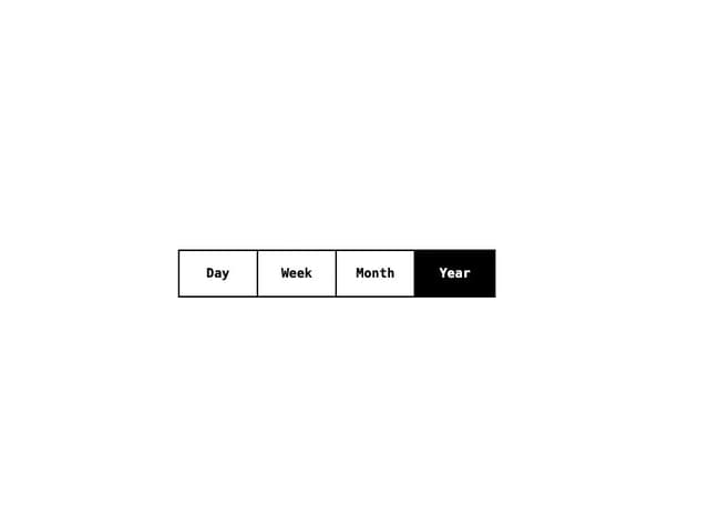
Segmented Control
2
Chip
2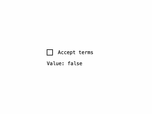
Checkbox
1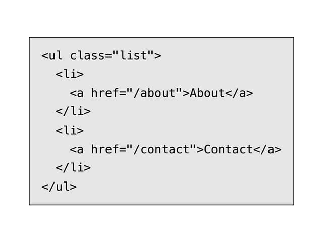
E-Ink Code
QR Code
More in Buttons
View all
Texture Button
108
Button
14

Notification Button
117

HeroUI Button Group
2

Eclipse Button
44
Button Save
50

App Store Button
484

Base Button
1


