About
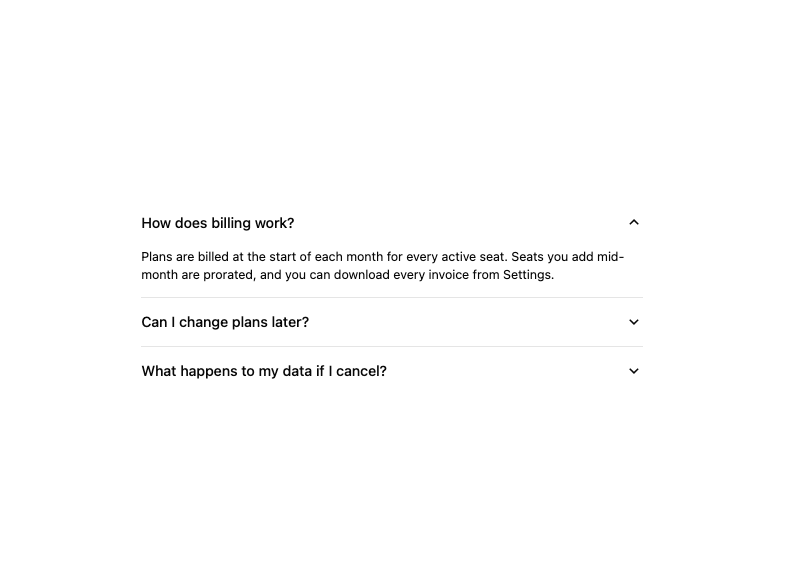
A set of stacked, expandable sections (FAQ-style, settings groups, order details) with divided, contained and separated visual styles and a smooth height/blur transition.
Built with React and Tailwind. Copy the prompt and paste it into Claude Code, Cursor or Lovable: your agent adds Accordion to your project and fits it to your theme.
Code
How Accordion is used: the demo's code. The component's own source comes with a free account.
Usage.tsx
import { Accordion, AccordionItem } from "@/components/ui/accordion";

export default function AccordionDemo() {
  return (
    <Accordion
      defaultExpandedKeys={["billing"]}
      className="w-full max-w-[560px]"
    >
      <AccordionItem id="billing" title="How does billing work?">
        <p>
          Plans are billed at the start of each month for every active seat.
          Seats you add mid-month are prorated, and you can download every
          invoice from Settings.
        </p>
      </AccordionItem>
      <AccordionItem id="plans" title="Can I change plans later?">
        <p>
          Yes. Upgrades apply right away, and downgrades take effect at the end
          of the current billing period, so you never lose access you have paid
          for.
        </p>
      </AccordionItem>
      <AccordionItem id="data" title="What happens to my data if I cancel?">
        <p>
          Your workspace stays readable for 30 days, so you can export
          everything. After that it is deleted for good.
        </p>
      </AccordionItem>
    </Accordion>
  );
}
Dependencies
More by boardui
View all

Social Button
3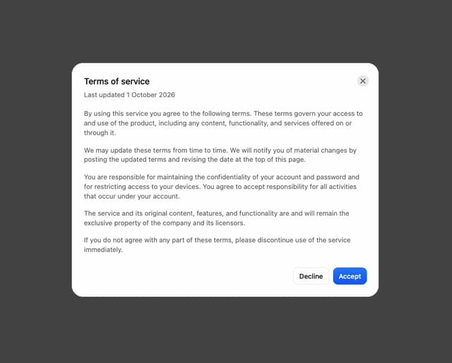
Modal Dialog
1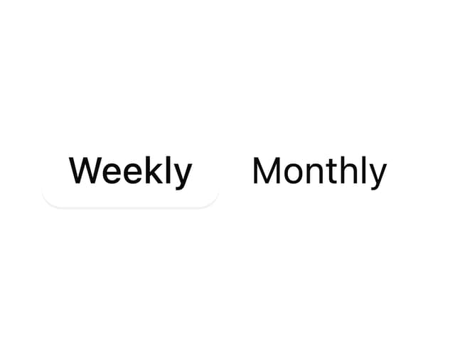
Segmented Control
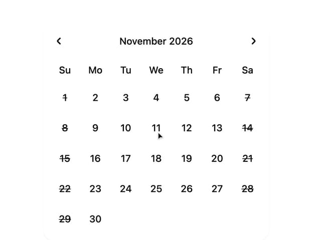
Date Calendar
Select
Composer Loader
Slider
File Upload