"use client";

import Link from "@/components/ui/link";

/** Adapted verbatim from the component's own Storybook story
 * (packages/react/src/components/link/link.stories.tsx, "Underlines")
 * — the three underline settings, resting in a line of prose. */
export default function LinkDemo() {
  return (
    <div
      style={{ display: "grid", gap: "var(--bs-space-3)", maxWidth: "28rem" }}
    >
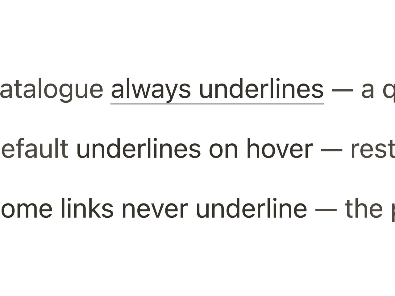
      <p style={{ margin: 0, color: "var(--bs-color-text-secondary)" }}>
        The catalogue{" "}
        <Link href="#" underline="always">
          always underlines
        </Link>{" "}
        — a quiet rail under the ink.
      </p>
      <p style={{ margin: 0, color: "var(--bs-color-text-secondary)" }}>
        The default <Link href="#">underlines on hover</Link> — rest keeps the
        page still.
      </p>
      <p style={{ margin: 0, color: "var(--bs-color-text-secondary)" }}>
        And{" "}
        <Link href="#" underline="none">
          some links never underline
        </Link>{" "}
        — the pigment alone carries them.
      </p>
    </div>
  );
}